Irrefutably, a rising number of individuals are using the internet on mobile devices instead of desktop PCs.
People, on average, spend approximately 7 hours each day consuming the internet on their mobile phones.
40% of buyers research their smartphone before making an in-person purchase. Most shoppers use their smartphones to make purchases regularly, and 55% make purchase decisions after exploring things on social media. As a result, businesses with responsive websites get more leads and maintain a growing competitive edge over those that do not.
Due to this change in consumer behavior, having a website that only functions from a desktop computer are no longer sufficient.
Without this, you can’t reach most web users, and your organization will likely lose valuable traffic and prospects.
So, how can you develop a successful mobile experience? This is where responsive web design comes into play.
“Responsive Web Design always plays an important role whenever going to promote your website.” – Mr. Josh Wilson.
The above quote is backed by research. As per the studies, businesses that do not have a mobile-friendly website are slipping well behind at an astonishing rate because 8 out of 10 visitors will abandon a website that does not exhibit well on their device.
But what exactly is responsive website design services, how does it function, and why must you make the jump?
This article aims to answer those questions, provide some relevant information, and teach you the fundamental responsive design characteristics that all businesses should be aware of.
So when you decide to hire a responsive web design company to design your site, you will be fully armed with all the information you need to make it a huge success.
Let’s get this ball rolling.
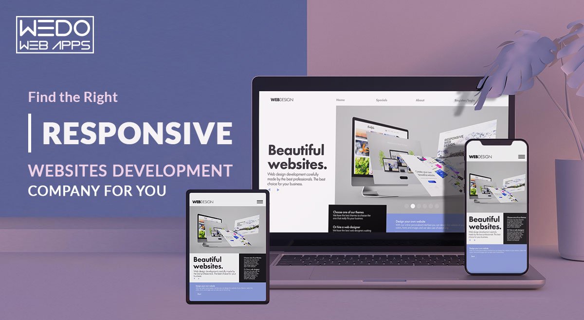
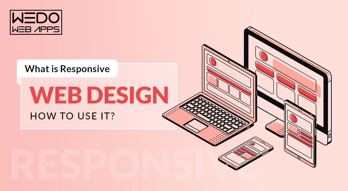
What is Responsive Design?
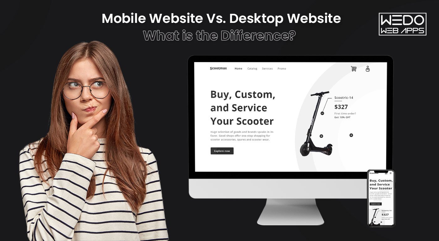
Simply put, responsive web design is the process of creating web pages that display optimally on all devices. Responsive websites are those that adjust to all screen resolutions and sizes, not just desktop but also mobile, iPad, and, in some cases, tv.
In totality, Responsive design is a web design strategy that adapts your site content to the various screen and window sizes of various devices.
For instance, your information might be divided into various columns on desktop screens since they are large enough to support that design.
However, users will find it difficult to read and engage with your content if you divide it into many sections on a mobile device.
Responsive design enables you to provide alternative layouts of your information and design to numerous devices based on screen size.
Why Responsive Web Design Matters?
With responsive design, you can reach a larger, more engaged community wherever and whenever they may want to browse. More significantly, a lack of flexible web design can isolate your website from customers seeking an engaging user experience. According to research, a bad mobile-friendly experience might cost you up to 90% of your potential clients. That’s a lot of people — and money. Let’s go over the primary advantages of responsive web design.
1. User experience
Your viewers will not have a nice experience if your site does not load properly on their devices. This critical factor can either turn these people into satisfied consumers or ensure they never return.
If someone has a negative experience while exploring your website, there is no guarantee that you will be given a second chance. After all, when searching the web for various services, customers have many possibilities to pick from. Therefore, make a pleasant experience a top concern.
2. Enhances rank and visibility
Google and other search engines are constantly looking for ways to improve the user experience. As a result, most of the criteria used to determine which websites receive top rankings are related to quality and relevancy.
Mobile-first indexing can affect how your webpage ranks and force it to be pushed down on results pages of search engines (SERPs) in support of websites that give users a mobile-friendly interface.
This is why the responsive site design is essential for search engine optimization. You may improve your ranking and exposure by ensuring that your website operates well in all screen sizes.
3. Session Timing and Bounce Rates
Aside from website building costs, responsive web design saves money and increases user retention. This, in turn, increases session time and decreases bounce rates. And both of these have an impact on search engine results.
Helps gain good brand recognition and consumer trust.
Aside from website security, responsiveness is also important for trust. You will lose users’ trust if your website lacks a responsive web design and provides a poor user experience. And this is an important factor in converting them into clients for your firm.
Wider audience reach
Finally, keep in mind that responsive site design might help you expand your reach. This entails encouraging more individuals to read your information and providing a positive experience related to your business.
By denying responsive web design, you are isolating a hefty chunk of your audience. Correcting this could result in good results in terms of views, conversions, and customer happiness.
Cost Effective
Businesses used to develop several websites to respond to various mobile viewports prior to responsive web design, and its accompanying became available. The user was shown a customized home page based on the device from which the request was made.
This is not a scalable strategy because it would necessitate changes in execution every time a new device is released to the market. This idea was used well before the mobile revolution took off! For businesses to succeed in this intensely competitive market, having an adaptable website that supports various viewports, browsers, and an OS is no longer an option—it is a necessity.
Responsive Vs. Adaptive Design
It is common to believe that responsive web design and adaptive web design are the same things. However, this is incorrect.
Responsive web design is adaptable, with your website’s elements rearranging as the screen resolution changes. This is significant given the wide range of screen resolutions available on computer monitors, cellphones, and tablets. As a result, even the most specialized values are catered to.
Adaptive web design, on the other hand, has predefined widths to work with, allowing for a changing layout based on them. While it may appear flexible, it may deliver a poor user experience to individuals who access your content at a non-predetermined resolution.
How Does Responsive Web Design Work?
A regular website is made up of a collection of files (each web page—home page, about page, etc.—has its own file). Each file comprises HTML code as well as content (text and images). Cascading Style Sheets (CSS) files are used to style web pages (CSS).
As a result, Responsive web design uses Cascading Style Sheets (CSS) to offer various style attributes based on the screen size, orientation, resolution, color capabilities, and other aspects of the user’s device. Viewport and media queries are two examples of CSS aspects relevant to responsive website design.
However, CSS and HTML are lengthy procedures.
The quick process for this situation would be a content management system (CMS) or a website builder. A content management system (CMS) is software that enables you to create your website without learning how to code — including how to code for responsive design. Site builders are similar solutions, but they forego part of the capability provided by a CMS in return for convenience and lower pricing. Responsive web design can be done with a CMS or site builder that supports responsive designs.
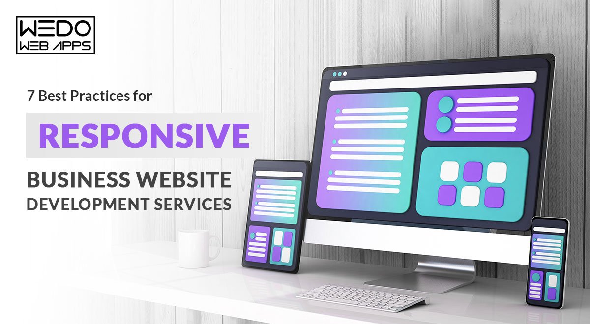
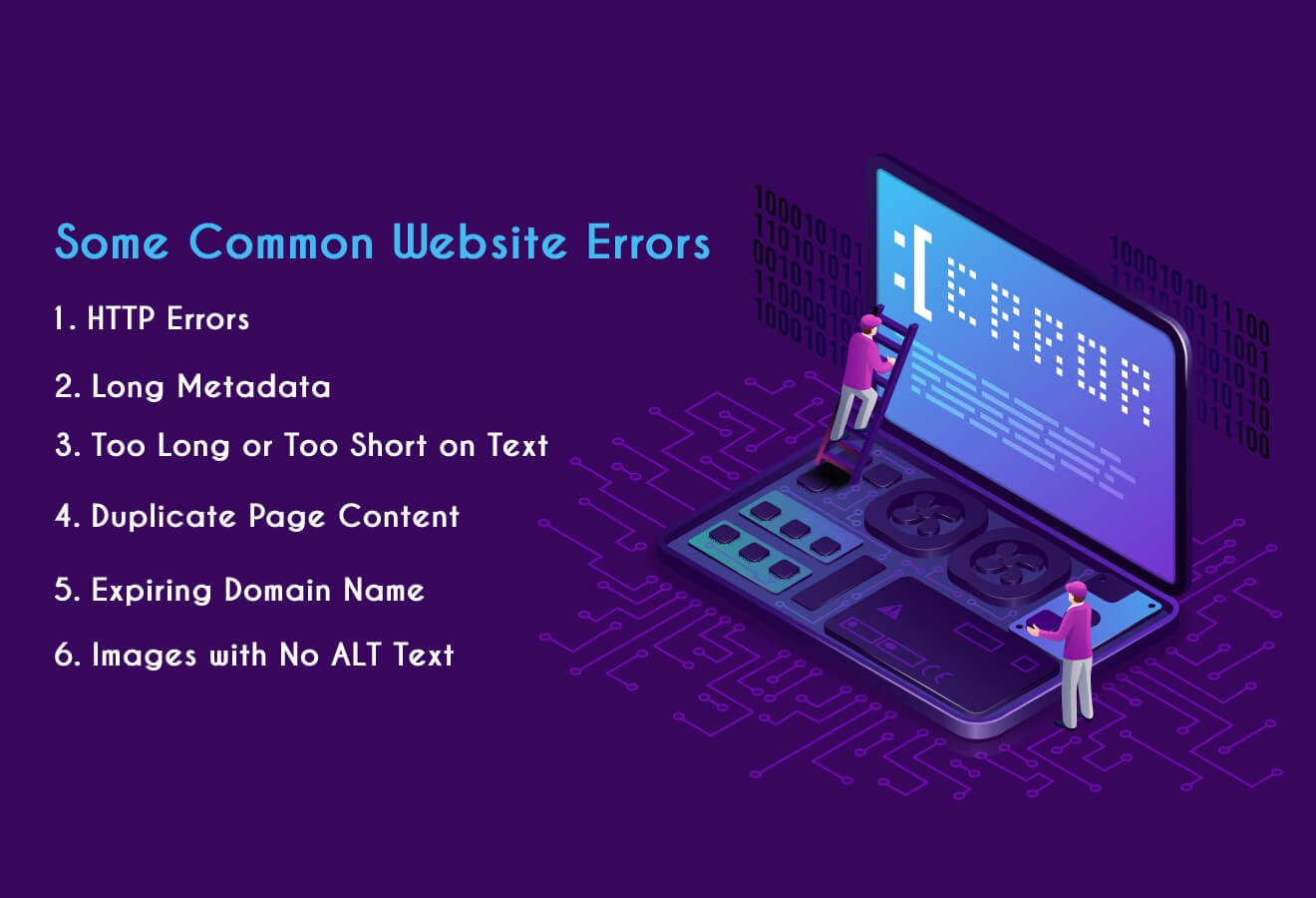
Best Practices of Responsive Design, That Makes Your Website Responsive?
Website Layout
The website layout is the first thing that comes to mind when we think of responsive web design. Engaging with it is the primary step toward improving the usability of your content.
An excellent place to start is to imagine your layout without first considering responsiveness. You can work with pixel widths that are suitable for most computer screens.
Then, in your CSS, start introducing media queries and conditions to assist in changing that basic layout into a responsive one.
One example is using a 1 x 1 aspect ratio on your page. Most mobile browsers display websites in full-screen mode, which minimizes them and depends on the zoom capability for navigation.
This procedure may be simplified if you are using CMS as it will have appropriate optimization WordPress Plugins.
Take Care Of Device Features – Buttons and CTA
Buttons
Want visitors to take action when they visit your site? This could be done by clicking a CTA such as Learn More, Subscribe, or even Buy.
But how do users engage with these icons on your desktop version? If these CTAs appear, scroll, or are at the bottom end of your website page, you may need to reconsider how phone viewers can access them.
In addition, determine the size of clickable sections on your mobile version as well. Unlike a desktop, where viewers can use a mouse cursor to click icons and hyperlinks, phone and tablet users navigate your page using their fingertips.
So, it is suggested that clickable items on mobile devices have a height of at least 48 pixels. Buttons, text boxes, inline links, and menu navigation are all examples of this.
CTA
Customers and prospective clients cannot call you on their PCs, but they can on their phones. Change your “Chat Now!” CTA to “Call Now!” and offer your company’s contact number instead of your email address. Furthermore, if your company has a mobile app, encourage visitors to access it from your website. As this is something, they may not be able to do on their laptops.
Responsive Breakpoint
A breakpoint in responsive web design is the “point” at which the site’s content and layout will adjust in a particular way to deliver the greatest possible user experience.
Every website is viewed through various devices with varying screen sizes and resolutions. So it must function flawlessly in all screen sizes. Images and content cannot be manipulated, cut out, or concealed.
To do this, developers must employ responsive breakpoints, also called CSS breakpoints or media query breakpoints. These are code-defined points. Website content interacts with these cues and modifies the screen size to exhibit the correct layout.
With CSS breakpoints in position, the website content will match with display size and showcase itself pleasingly and seamlessly.
Fluid Grid
Earlier, websites were measured in pixels. They are now, however, built on what is known as a fluid grid.
A fluid grid, in essence, arranges and adjusts web elements on a site in line with the screen size on which they are displayed. So, rather than designing objects in a single, fixed-size measured in pixels, items on a fluid grid would adapt and adjust to fit the screen’s dimensions.
A fluid grid is organized into columns; heights and widths are adjustable rather than fixed. As a result, the text and element dimensions change depending on the screen size.
Working on the source code of a website allows you to create the parameters of a fluid grid. A fluid grid also aids in maintaining a site’s visual consistency across several devices. Additionally, it helps you to make design decisions more quickly and offers you greater control over alignments.
Images Scale
Visuals and icons aren’t the only types of material that change size depending on the device. Your photographs must also be scaled. Desktop webpages, for instance, may require photos with a resolution of 1200 pixels, while mobile websites may demand images with a resolution of 400 pixels. Using a higher resolution on all devices can slow down your loading time. Thus, it’s not advisable.
Consider uploading multiple image resolutions and specifying which image you wish to showcase on each device. This is commonly accomplished in website code by allocating distinct “media” tags to appropriate “source” objects (e.g., iPad or mobile).
Read also: Responsive Website Design: Know the Fundamentals
Additionally, images or icons must be formatted as scalable vector graphics (SVGs). Unlike all the other media formats, such as JPGs and PNGs, SVGs can be resized indefinitely. This ensures that your website gives users on every device a high-quality surfing experience. They also ensure that your website loads faster, which is important for user experience and SERP rankings.
Typography
A typeface that looks great on your desktop version may not appear well on a smartphone that is a quarter of its size. In addition, visitors who cannot read your website will almost probably not click on or purchase anything.
Centering your website typefaces around the mobile website, on the other hand, can leave your desktop customers with unsightly words that are overly huge and conflict with your brand image.
Here are some greatest font tips for responsive web design:
- The rule of thumb for desktop and smartphone online content is 16pt body type.
- Avoid ultra-thin fonts that disappear on tiny displays.
- Make sure all headings are more significant than the body’s text and subheadings.
- Choose contrasting colors for your typeface so that it does not blend into the backdrop colors of your website.
Testing
Without adequate testing, you cannot complete any responsive web design project. In addition, you must ensure that your layout functions properly on all devices and in all scenarios.
Most recent browsers feature a testing environment that allows you to test your layout with various user agents and sizes.
Also, keep in mind your ideal audience’s most usual access situations. This must pertain to your layout, navigating experience, and text type.
Examples Of Responsive Design Website
Although having access to the world’s leading responsive web design service providers gives these companies an edge, it doesn’t mean small and medium-sized businesses cannot have a good, responsive web design. They surely can! You need to look in the right direction.
Let’s look at 3 amazing responsive web design examples and ideas, so you can see what responsive web design looks like in action and get some ideas for your site.
Example #1: Dropbox
Dropbox’s website is an outstanding example of how responsive UX design can significantly impact user behavior on various screen sizes. It elevates responsive design by exhibiting what appear to be utterly separate web pages based on your device.

Dropbox Desktop View
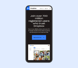
Dropbox Mobile View
As the iPad and desktop editions extend to incorporate a full navigation bar, we can observe the fluid grid in play. When the mobile version is clicked, the hamburger menu displays vertical navigation.
The header in each of the three versions is entirely different. Each version concentrates on a single core CTA, although the desktop CTA differs from the mobile and tablet CTAs: “Sign up for free” vs. “Find your plan.” This indicates that Dropbox’s study revealed distinct user intent for various devices.
Example #2: Etsy
Another example of how the flexible grid approach can be used to ensure that your website display differ based on the device is Etsy’s site.
Here is the Etsy website on three different devices:

Etsy Desktop View
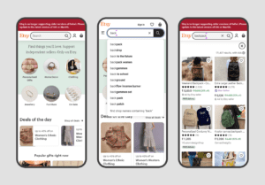
Etsy Mobile View
Clearly, Etsy focuses on personalization to provide visitors with a seamless user experience. All we can say is their responsive website design service did a fantastic job of capturing so many elements in one place without feeling overcrowded.
Example #3: Wired
The webpage of the online technology magazine Wired is an excellent example of how fluid grids may dynamically modify column arrangement based on device attributes such as screen width.
We can see two versions of their website in the photographs below:

Wired Desktop View
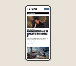
Wired Mobile View
Both the PC and tablet versions are identical. However, for better readability, the mobile version displays only one column. Also, the ad is displayed differently depending on the device, with the smartphone version showing simply the heading copy and inviting a tap.
Conclusion
With so many people shopping and surfing on their smartphones, responsive design is necessary. Without that, business is a blind net that may lose leads, customers, and income.”
Now that you’ve learned everything there is to know about responsive web design, it’s time to bring it all together. Use the information provided in this post to address the issue and work with responsive web design services to take your design to a new level!