
Layouts for Websites: The Foundation of Effective Web Design
A website's layout determines how visitors navigate, interact, and respond to your content. From simple single-column structure to creative asymmetrical designs, the right layout improves usability, engagement, and conversions.
Vibrant colors, stunning images, and engaging content can make a website attractive. But, the true essence of a site is in its layout. When you remove the decorations, the layout remains. It reveals how crucial it is in defining the website's brilliance and function. The layout is the backbone that supports and enhances the user experience.
This guide presents modern website layout ideas, and practical inspiration to help you choose the structure that fits your goals and audiences.
What Exactly Is a Website Layout?
A website layout is the structural framework that organizes content, navigation, visuals, and interactive elements so users can easily browse and find information. It is the blueprint that shapes a website's structure. It organizes all the information on a site for both the owner and visitors. A layout creates clear paths and highlights key elements. It ensures users can easily find what they want.
It doesn't matter if you're starting a blog or building a business website. The layouts for websites set the content's hierarchy. It guides visitors through your website, helping to communicate your message effectively.
In short, a well-designed layout is crucial for the success of any website.
Key Components of a Website Layout
- Header with logo and navigation.
- Main content area.
- Visual elements such as images or videos.
- Sidebars or supporting sections.
- Call-to-action areas.
- Footer with additional links and information.
A well-structured layout not only organizes content but also guides visitors toward meaningful actions on the website.
Why Choosing the Right Layout Matters?
The layout influences how easily visitors understand your website, navigate content, and decide whether to stay or leave.
Selecting the right layout is crucial for several reasons:
A good layout keeps visitors on your site by making important information easy to find and navigate. But, a bad layout frustrates users. It causes them to leave quickly because they can't find what they need.
A well-designed layout helps to:
- Make important information easy to find.
- Improve navigation and usability.
- Increase time spent on the site.
- Encourage users to explore more pages.
- Support conversions such as purchases or sign-ups.
It's worth taking the time to choose a good layout. Users decide in seconds whether to stay on your site. The layout directly impacts user engagement. It influences how long they stay, how many pages they visit, and if they return.
Additionally, a good layout offers more than just overcoming quick user judgments. It enhances overall engagement, which can be highly beneficial.
Design principles such as the Gestalt law of closure explain how users naturally perceive patterns and complete visual gaps. When applied thoughtfully, these principles help to create a layout that feels more organized, intuitive, and easy to understand at a glance.
Choosing the right layout is not only about appearance. It directly affects usability, engagement, and how effectively your website achieves its purpose.

Mastering Essential Layout Design Principles
To make the most of your layout design choices, it's crucial to understand some fundamental concepts about website layouts. Here are a few key ideas to guide you through the myriad of predefined layouts available:
Visual Weight and Negative Space
Visual weight refers to how certain elements on a webpage draw more attention than others. This can be achieved through various techniques, with negative space being particularly effective. Negative space, or empty areas on the page, highlights elements with stronger visual force.
For instance, consider a design with a large black square and four smaller white squares. The empty space around the black square makes it more prominent, drawing the viewer's attention. The black square has a stronger visual impact. This is compared to the smaller white squares. It shows the power of visual weight and negative space.
Creating Balanced Website Layouts
Balanced web design ensures that all elements support one another, giving equal importance to text and visuals. This approach makes the content easily scannable and presents it in a cohesive manner. The result is a stable and aesthetically pleasing design.
A popular method for achieving balance is symmetrical design. Similar to a mirror image, symmetrical layouts have visual elements that appear the same on either side of the center. This symmetry creates balance, elegance, and harmony. It is like what you see in architecture, gardens, and even butterfly wings.
Designing Sections for Different Audiences
Creating a website layout is crucial. It must allow users to easily move between sections and address specific audiences. Consider fashion websites that target both men and women, for example.
These sites often feature distinct sections for men's and women's apparel. This divided layout serves each audience well. It provides content tailored to their needs. This way, the site lets users find things quickly. They can find the info or products they want. This makes their experience better.
Crafting Layouts to Achieve Website Goals
Before you start designing a layout or browsing through templates, it's essential to define your website's goals. You may aim to sell products, attract traffic, or delight users with art. Your layout should align with these goals. The right layout will encourage user behaviors. It helps achieve your goals and ensures your website fulfills its purpose well.

Top Website Layouts with Proven Effectiveness in 2024
Here are some of the most popular website layouts. Designers around the world use them to create powerful and engaging websites.
1. The Zig-Zag Layout

Research shows that users often scan webpage content in a Z-pattern:
- First, the eye moves from left to right.
- Then, it goes down and to the left.
- Finally, it moves back across to the right.
Because it aligns with this common browsing behavior, the zig-zag layout is suitable for a wide variety of websites across different industries.
Best For: Landing pages, promotional sales, and simple business websites.
Why it Works: Matches natural scanning behavior for quick information processing.
2. The F-Shape Layout

The F-shape layout follows a common scanning behavior where users' eyes move across the page in an F-pattern:
- The eyes first move horizontally across the top.
- Then they move down a bit and scan another horizontal section.
- Finally, they move vertically down the left side.
It aligns with the natural reading pattern. So, the F-shape layout is effective for many types of websites. These include e-commerce and portfolio sites.
Best For: Blogs, news sites, content-heavy pages.
Why it Works: Aligns with typical reading behavior for text-focused content.
3. Full-Screen Photo Layout

Source: Newcastle
This layout features content overlaid on a full-screen photo or image. Text and menu sections are strategically placed to enhance the visual impact, making the image the focal point. This approach is ideal for websites that want to make a strong first impression and instantly convey the site's theme or message to visitors. It's particularly effective for portfolios, travel sites, and businesses looking to showcase their brand visually.
Best For: Portfolio, travel websites, brand storytelling.
Why it Works: Creates strong visual impact immediately.
4. Grid Layout

A grid layout organizes information into a grid. This makes content easy to browse and lets users focus on topics. This design evenly spreads text, photos, and videos on the webpage. It lets users choose the importance of each element. The grid layout is great for content-rich websites like newspapers, blogs, and vlogs. It gives a clear, tidy way to show a lot of information. This layout ensures a clean, balanced appearance that enhances user experience and engagement.
Best For: eCommerce, galleries, content-rich sites.
Why it Works: Makes large amounts of information easy to browse.
5. One-Column Layout

The one-column layout organizes all information into a single, straightforward column. It's one of the simplest layouts to use. It makes text, photos, and videos easy to follow without much scanning. This design is ideal for research papers and long-form articles. It is good for content that benefits from a linear reading flow.
Additionally, one-column layouts are perfect for mobile experiences, ensuring that content is easily accessible and readable on smaller screens.
Best For: Long-form content, research articles, mobile experiences.
Why it Works: Provides a simple, distraction-free reading path.
6. Captivating Featured Image Layout

A widely used layout today involves setting up a prominent featured image for each page on the website. This image captures attention and serves as a focal point that visually represents the page's topic. It not only draws interest but also provides a clear, visual summary of the content, enhancing user engagement. The featured image becomes the central element from which the page's meaning radiates. This layout is especially effective for niche blogs, freelancers, and professionals looking to make a strong visual impact.
Best For: Blogs, personal brands, creative professionals, niche websites.
Why it Works: Delivers a strong visual summary and draws users into the content.
7. Embracing Asymmetry in Layouts

The asymmetrical layout bends the rules of symmetry to create a unique and dynamic design. By playing with balance and creating active spaces, it makes white space more engaging and lively. This layout suggests that there is more to offer than just perfection.
It's great for creative web design sites. Also, for unique portfolio presentations and innovative business websites. The layout is asymmetrical. It captures attention with its unconventional approach. It's perfect for brands that want to stand out and show their originality.
Best For: Creative agencies, portfolios, and innovative brands.
Why it Works: Stands out visually while conveying originality and creativity.
8. Engaging with Split Screen Layouts

The split screen layout can be either vertical or horizontal, or even a combination of both. A vertical split screen is great for showing two or more distinct areas. It makes it easy for users to make quick choices and to engage with the site right away.
In some cases, a layout may feature both vertical and horizontal splits on the same page. This approach doesn't force a choice. Instead, it improves the user experience by letting sections complement each other.
The split screen layout is good for online stores. These stores cater to different demographics such as men's and women's sections. It is also good for creative websites that promote wellness and other lifestyle themes. This design effectively balances multiple elements, making the overall experience more dynamic and interactive.
Best For: eCommerce sites targeting multiple audiences, product comparisons, lifestyle brands.
Why it Works: Helps users quickly choose distinct options.
9. Headline and Thumbnail Gallery Layout

In today's visually-driven online landscape, the headline and thumbnail gallery layout can be incredibly effective. This design features small image thumbnails that link to detailed descriptions, accompanied by headlines and brief summaries to guide users through the visual content.
This layout is perfect for travel websites, blogs, and magazines. It offers an engaging and organized way to present a wealth of visual information. It captivates users with striking visuals while providing easy navigation through various topics.
Best For: Magazines, travel sites, news portals, content hubs.
Why it Works: Combines visual browsing with structured navigation.
10. Modular Layout (Card Layout / Block Layout)

Source: Sky News
The modular layout, also known as card or block layout, is closely associated with Google's Material Design. This layout is gaining popularity for its flexibility and responsiveness. In a modular layout, each content unit, whether text, images, videos, or buttons, is contained within its own card or module, providing a dedicated space for each element.
Applying modular layouts to websites results in a streamlined appearance and a highly organized composition of items on the page. This layout is ideal for business websites, where clear, coherent presentations are essential for maintaining a professional online presence.
Best For: Business websites, dashboards, product listings, service pages.
Why it Works: Creates a clean, organized structure that adapts well to different screen sizes.
11. Magazine Layout

Modern magazine layouts often blend various design elements to create a visually rich and engaging presentation. This layout typically combines features like headline and thumbnail galleries, featured images, and an F-shaped layout to maintain the magazine's glamorous appeal.
These combinations work well for online magazines but can also be effective for other content-heavy websites. They offer a dynamic and captivating way to present information.
Best For: News websites, online publications, blogs with frequent updates.
Why it Works: Presents large volumes of content in an engaging, hierarchical format.
12. Single Page Layout

Source: FreeConvert.com
The single page layout stands out for its unique characteristics. It consolidates multiple actions into a single page, with content dynamically loaded using JavaScript. This layout also generates unique URLs for each section, providing a seamless and interactive user experience. Examples include applications like Gmail.
The single page layout is ideal for applications and websites that aim to offer a streamlined, uninterrupted user experience.
Best For: Small businesses, product launches, portfolios, event websites.
Why it Works: Provides a seamless browsing experience without interruptions.
13. Radial Symmetry Layout

The radial symmetry layout is a less common but visually striking design. In this layout, elements are arranged around a central point, radiating outwards in a circular pattern. This creates a balanced and harmonious appearance, drawing attention to the central element while maintaining a cohesive structure for the surrounding items. This layout is ideal for websites looking to make a unique visual impact.
Best For: Artistic websites, experimental designs, niche brands.
Why it Works: Naturally draws attention to the center while maintaining visual harmony.
14. Parallax Scrolling Layout

The parallax scrolling layout creates an immersive experience by allowing background images to move slower than foreground images as users scroll down the page. This effect adds depth and a sense of motion, making the website more engaging and visually appealing.
This layout is ideal for storytelling websites, product showcases, and creative portfolios. It captivates visitors and encourages them to explore the site further, enhancing the overall user experience.
Best For: Storytelling websites, product showcases, creative portfolios.
Why it Works: Produces an immersive and memorable browsing experience.
15. Boxed Layout

The boxed layout confines the content within a fixed-width container, often surrounded by margins or padding. This design creates a clean and organized look, making it easier for users to focus on the content without distractions from the background.
Boxed layouts are perfect for business websites, blogs, and e-commerce sites. They offer a structured and professional appearance, ensuring that the content remains the focal point while maintaining a cohesive and user-friendly design.
Best For: Corporate sites, blogs, eCommerce stores.
Why it Works: Keeps focus on content while maintaining a clean, structured appearance.
16. Bento Grid Layout

Inspired by compartmentalized bento boxes, this layout arranges content into neatly organized blocks of varying sizes.
Best For: Product websites, tech platforms, portfolios.
Why it Works: Presents diverse content clearly while maintaining visual balance.
17. Dashboard-Style Layout
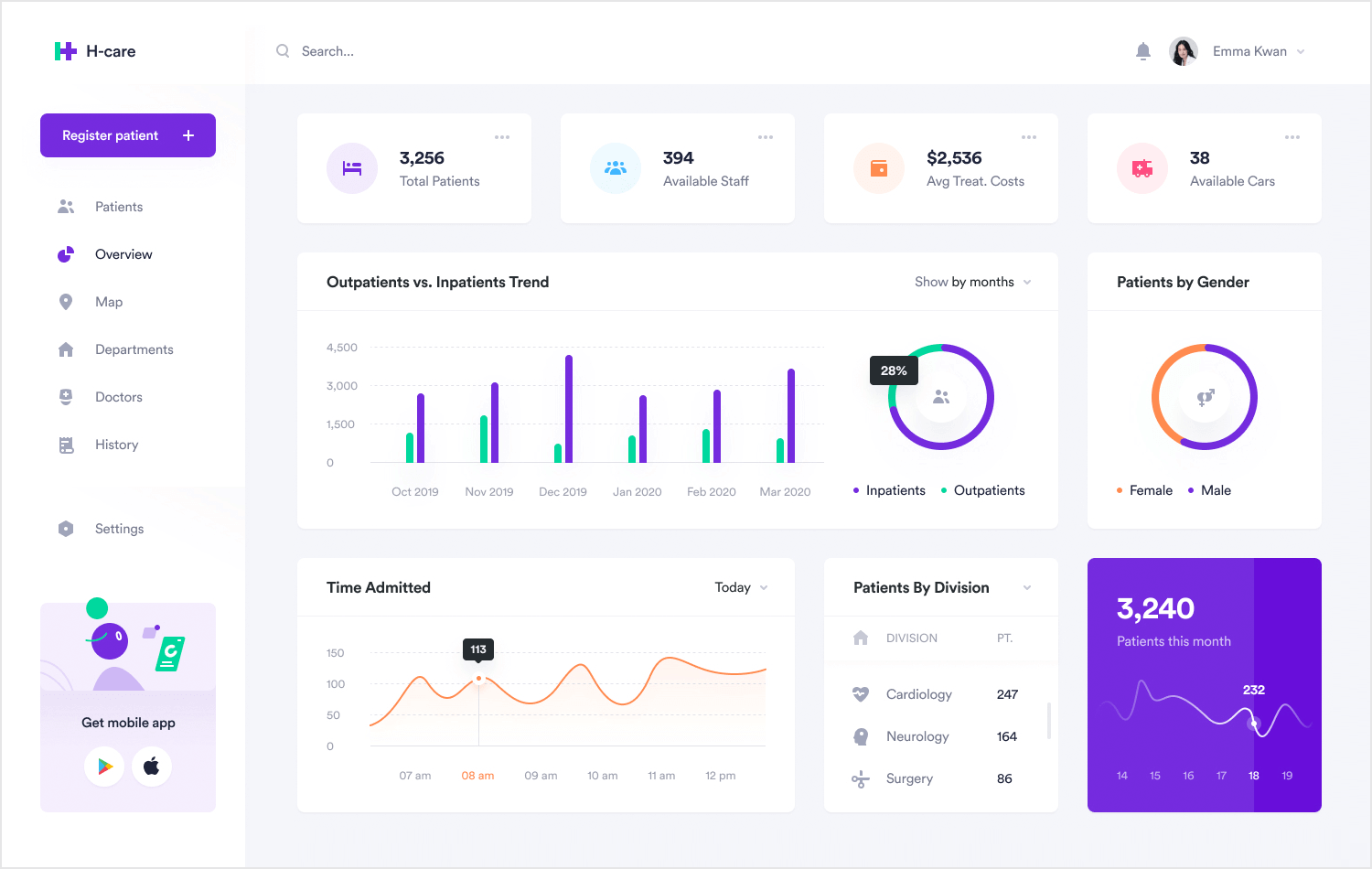
Designed like application interfaces, this layout prioritizes quick access to tools, metrics, and navigation panels.
Best For: SaaS platforms, analytics tools, admin portals.
Why it Works: Supports efficient interaction and data visibility.
18. Minimalist Layout
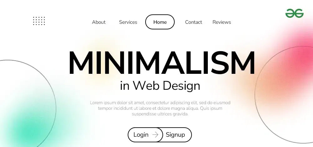
This layout removes nonessential elements and focuses on clarity, typography, and spacing.
Best For: Professional services, luxury brands, portfolios.
Why it Works: Reduces distractions and communicates sophistication.
19. Storytelling Scroll Layout

Content unfolds sequentially as users scroll, often enhanced with animations and transitions.
Best For: Brand storytelling, product launches, campaigns.
Why it Works: Guides users through a narrative journey.
20. App-Style Navigation Layout

Resembles mobile applications with persistent menus, panels, and interactive components.
Best For: Web apps, tools, community platforms.
Why it Works: Feels familiar to users accustomed to mobile interfaces.
How to Choose the Best Website Layout for Your Needs

Selecting a layout is not just about visual appeal. The right structure should support your goals, audience expectations, and type of content. Consider the following factors before making a decision.
Website Purpose
Start by defining what your website needs to achieve.
- Business sites should focus on clarity and trust.
- eCommerce stores require easy product browsing.
- Portfolios should highlight visual work.
- Blogs prioritize readability and content flow.
A layout that aligns with your purpose helps visitors take the desired action.
Target Audience Behavior
Understanding how your audience interacts with websites is essential.
For example, younger users may prefer visually rich, interactive layouts, while professional audiences often value clean and straightforward structures.
Design choices should reflect how your visitors browse and what they expect to find quickly.
Content Volume and Type
The amount and format of your content strongly influence layout selection.
- Content-heavy sites benefit from grid or magazine layouts.
- Image-focused sites work well with fullscreen or gallery layouts.
- Data-driven platforms often use dashboard-style layouts.
- Minimal content may perform better with single-page designs.
Choosing a layout that fits your content prevents clutter and confusion.
Device Usage and Responsiveness
Most traffic now comes from mobile devices, making responsive design essential.
Single-column, modular, and card-based layouts adapt well to smaller screens, ensuring readability and usability across devices.
A mobile-friendly structure improves both user experience and search visibility.
Navigation Complexity
Consider how many pages and sections your site will contain.
Simple websites can rely on straightforward navigation, while large platforms may require layered menus, filters, or sidebar navigation systems.
Clear navigation prevents users from feeling lost.
Brand Personality and Visual Style
Your layout should reflect your brand's identity.
- Creative brands can experiment with asymmetry and bold visuals.
- Corporate organizations benefit from structured layouts.
- Premium brands often use minimalist designs.
- Innovative companies may adopt unconventional formats.
Consistency between layout and brand message strengthens credibility.
Choosing a layout that balances usability, aesthetics, and functionality ensures your website delivers a positive experience while achieving its objectives.

Website Layout Ideas by Industry
When exploring website layout ideas, it is important to remember that different industries require different structures. The way information is presented on a corporate site is very different from how products are displayed in an online store or how articles appear on a blog. Choosing the right web page layout ideas for your field helps users navigate easily and builds confidence in your brand.
Below are some modern website layout designs and website design layout examples tailored to specific industries for inspiration.
Business and Corporate Websites
Corporate websites need to communicate professionalism, services, achievements, and contact information clearly. Visitors are often evaluating credibility, so the layout should feel structured and trustworthy.
Popular website layout ideas for corporate sites include:
- Grid and modular layouts for organizing services.
- Boxed layouts for a clean, formal presentation.
- Minimalist designs to highlight key information.
- Structured sections for testimonials, case studies, and company details.
These website design layout examples make large amounts of information easy to scan while maintaining a polished appearance.
eCommerce Websites
Online stores require creative website layouts that make browsing products simple and enjoyable. Users typically want to compare items quickly, view images clearly, and complete purchases without obstacles.
Effective web page layout ideas for eCommerce include:
- Product grid layouts for displaying many items at once.
- Modular or card-based designs for product categories.
- Split screen layouts to highlight promotions or collections.
- Dashboard-style pages for user accounts and order tracking.
These modern website layout designs reduce friction and help shoppers move smoothly from discovery to checkout.
Portfolio Websites
Portfolio sites focus on showcasing work visually, making them ideal for creative website layouts that emphasize images and projects rather than text.
Website layout inspiration for portfolios often includes:
- Full screen image layouts for strong visual impact.
- Asymmetrical designs that reflect creativity.
- Gallery or grid formats for project collections.
- Bento-style layouts to present diverse work neatly.
These website design layout examples allow visitors to quickly evaluate skills and style, which is crucial when attracting clients or employers.
Blogs and Media Websites
Content-driven sites require website layout ideas that support readability and frequent updates. Readers often skim headlines before choosing what to read, so layouts must prioritize scanning behavior.
Common web page layout ideas for blogs include:
- F-pattern layouts aligned with reading habits.
- Magazine-style layouts for content-heavy sites.
- Thumbnail galleries to showcase multiple posts.
- Single-column layouts for long-form articles.
These modern website layout designs help readers navigate large volumes of content without feeling overwhelmed.
SaaS and Technology Platforms
Technology websites must explain complex products clearly while guiding users toward actions such as signing up or requesting a demo. The layout should simplify information rather than add confusion.
Creative website layouts commonly used by SaaS companies include:
- Modular layouts that break features into sections.
- Dashboard-style designs resembling app interfaces.
- Minimalist layouts that emphasize value propositions.
- App-style navigation familiar to modern users.
These website layout ideas make sophisticated tools feel approachable and easy to understand.
Selecting industry-specific website layout inspiration ensures your design meets user expectations while presenting information in the most effective way. When structure, content, and audience needs align, even complex websites can feel intuitive and engaging.
Website Layout Trends for Modern Website Design (2026)

Staying updated with current trends helps your site feel modern, engaging, and user-friendly. The latest modern website layout designs focus on personalization, clarity, and immersive visuals while maintaining fast performance.
Here are the most impactful website layout ideas shaping websites in 2026.
AI-Personalized Layouts
Content adapts based on user behavior, location, or preferences, improving relevance and engagement.
Glassmorphism Interfaces
Blurred backgrounds and translucent panels add depth while keeping the layout clean and minimal.
Bold Minimalism
Simple structures paired with large typography and strong visual hierarchy for quick communication.
Card-Based Layouts
Modular content blocks organize information clearly and work well across all devices.
Dark Mode-First Design
Modern interfaces optimized for dark themes, improving comfort and visual contrast.
Subtle 3D and Interactive Elements
Light animations and depth effects create memorable, modern experiences without overwhelming users.
Hybrid Layout Structures
Combining multiple layout styles on one page to support different content types effectively.
Following these trends can provide fresh website layout inspiration while ensuring your design meets current user expectations.
Common Website Layout Mistakes to Avoid

Even the most creative website layouts can fail if usability issues are ignored. Avoiding common mistakes ensures your design remains clean, functional, and user-friendly while supporting your goals.
Here are the most frequent problems seen across modern website layout designs.
Overcrowded Pages
Adding too many elements on one screen makes it difficult for visitors to focus.
- Reduces readability.
- Increases cognitive load.
- Weakens key messages.
- Makes the design feel unprofessional.
A clean structure improves clarity and engagement.
Confusing Navigation
If users cannot find what they need quickly, they will leave.
Common issues include unclear labels, too many menu items, or hidden navigation elements. Clear and intuitive menus are essential for effective web page layout ideas.
Ignoring Mobile Responsiveness
Layouts that look good on desktop but break on mobile create a poor user experience.
- Text becomes hard to read.
- Buttons may be difficult to tap.
- Content can appear misaligned.
Responsive design is no longer optional for modern websites.
Excessive Popups and Distractions
Too many popups, auto-playing media, or flashing elements interrupt the browsing experience.
While promotional elements can be useful, they should not block content or overwhelm visitors.
Poor Visual Hierarchy
When everything looks equally important, users struggle to know where to focus.
Effective layouts guide attention using size, spacing, contrast, and positioning.
Low Contrast and Readability Issues
Text that blends into the background or uses small fonts reduces accessibility.
Readable typography and sufficient contrast are essential for all users, including those browsing on smaller screens.
Avoiding these mistakes will help you create modern website layout designs that are not only visually appealing but also easy to use and effective at converting visitors.

Best Practices for Creating an Effective Website Layout

A successful layout is not only visually appealing but also easy to navigate and aligned with user expectations. Applying proven design principles ensures your site performs well across devices and keeps visitors engaged.
Here are essential best practices behind effective modern website layout designs.
Plan With a Clear Structure
Start with a wireframe or content outline before designing visuals.
- Define key sections and priorities.
- Organize information logically.
- Focus on user goals first.
A well-planned structure prevents clutter later.
Use a Consistent Grid System
Grids create alignment, balance, and visual harmony across pages.
They help designers maintain spacing, organize content blocks, and build scalable website design layout examples that look professional.
Establish Strong Visual Hierarchy
Guide users toward important information using size, contrast, and spacing.
- Highlight headlines and key messages.
- Make calls to action stand out.
- Group related content together.
Clear hierarchy improves readability and decision-making.
Design for Mobile First
Most users browse on smartphones, so layouts should adapt seamlessly to smaller screens.
Single-column structures, large touch-friendly buttons, and readable text are essential for effective web page layout ideas.
Keep Navigation Simple
Visitors should reach any important page within a few clicks.
Use clear labels, logical grouping, and familiar menu patterns to avoid confusion.
Prioritize Speed and Performance
Heavy visuals, large scripts, or complex animations can slow down loading times.
Optimized images and lightweight design elements improve both user experience and search visibility.
Place Clear Calls to Action
Every page should guide users toward the next step.
Whether it is contacting your business, signing up, or making a purchase, visible and well-placed buttons increase conversions.
Applying these best practices will help transform creative ideas into functional, user-focused website layouts that deliver measurable results.
Conclusion: Choosing the Right Layout for Your Website
Now that you're familiar with various website layouts, it's time to determine which one best fits your site. Should you go for a multi-purpose layout or one tailored to a specific niche?
To make this decision, understand your audience, their behavior, needs, and expectations. Craft a message that aligns with these insights and select a layout that allows this message to stand out. The right layout will enhance your message, making it compelling and engaging for your users.


 Sharing Project Details
 Let's have a call
 Got Questions? Let’s Chat!