
React is a widely-used JavaScript library. It is key for crafting dynamic and responsive user interfaces in web applications. React now offers additional features, like the ReactJS Carousel Component Libraries. These enhance its functionality. In this blog post, we’ll explore Carousel Component Libraries. We’ll also look at their growing trends. This will provide insights for creating modern carousels for React-based web applications in 2024. This guide aims to equip you with the latest tools and practices. It will help you implement carousels in your React projects effectively.
Exploring React Carousel Features
As we navigate the web, we frequently encounter various features. We recognize them, but may not fully understand how to implement them in our own projects. One such feature is the ReactJS Carousel. It is an important UI component in React-based web applications. It allows the seamless display of a series of contents or images in a rotating fashion. React is popular in web development because of its component-based structure. It offers flexibility to create and reuse UI components. You can use them across web and mobile platforms.
The React Carousel is a pre-designed package. It provides ready-to-go carousel components for React apps. These libraries have many functions. They make it easier for developers to add carousels to their projects without starting from scratch. Common features in these components include image and content carousels, responsive designs, navigation controls, autoplay options, infinite scrolling, and more.
We’ve understood the basics of the ReactJS Carousel Component Libraries. Now, let’s delve into the specifics of these component libraries.
Exploring the Best 15 Top-Tier React Carousel Component Libraries
Choosing the right carousel component can be overwhelming. There are so many options available. To simplify this task, we’ve compiled a list of top-notch React Carousel Components. These libraries are designed to elevate the user experience in your React applications. Let’s dive into these exceptional options.
1. SwiperJS: A Versatile Mobile Touch Slider
SwiperJS, also known as React Slider Swiper, is a robust mobile touch slider library. It’s designed to deliver seamless transitions and a native-like experience on mobile devices. SwiperJS is ideal for mobile websites, apps, and native or hybrid mobile applications. It simplifies slide animations. Key features include image lazy loading. It also includes default transition effects and uses CSS flexbox for slide layout. This enhances the overall functionality and user experience.

Check SwiperJS NPM Trends All Time Downloads graph:

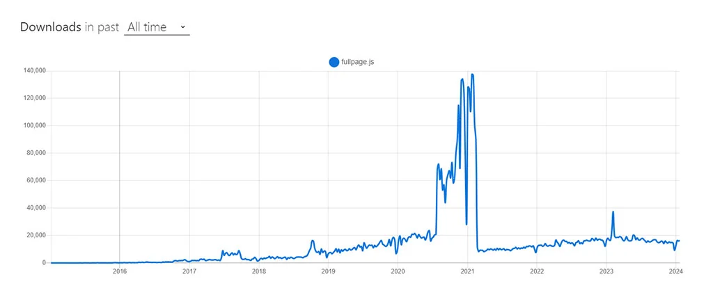
2. FullPage.js: Top-Notch Full-Screen Carousel for React
FullPage.js is a highly versatile full-screen carousel component tailored for React applications. Renowned for its configurability, it offers an efficient fullscreen page slider. This tool is perfect for creating snap-scrolling navigation. It works in both horizontal and vertical directions. It works across various sections in single page applications (SPAs). It is easy to use and adaptable. People often choose it to improve user navigation in React projects.

Check FullPage.js NPM Trends All Time Downloads graph:
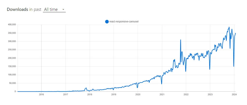
3. React Responsive Carousel: A Feature-Packed, Lightweight Library
The React Responsive Carousel is a lightweight yet feature-rich library. It’s designed for crafting carousels in React applications. It boasts a wide array of customization features. It includes options for lazy loading, YouTube autoplay, creating custom thumbnails, and implementing external controls. The library also supports vertical scrolling. It offers additional visual effects, such as fade transitions and a presentation mode. While it provides many benefits, it’s worth noting that its drag feature might not be as smooth as some other carousel options. When releasing the mouse or lifting a finger off the screen, the drag might not be as smooth.

Check React Responsive Carousel NPM Trends All Time Downloads graph:
4. React-swipeable: Simple and Dependable Carousel Component
React-swipeable is a user-friendly and dependable carousel component in the React ecosystem. It focuses on making carousel items swipeable. It may offer a more limited set of options compared to others. However, its ease of implementation is a significant advantage. React-swipeable’s distinguishing feature is its ability to accurately respond to various swipe patterns. This functionality is not typically seen in similar carousel components. This unique feature positions it as a notable choice among ReactJS carousel offerings.

Check React-swipeable NPM Trends All Time Downloads graph:
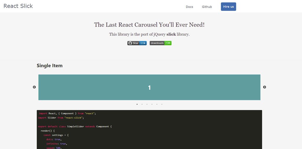
5. React Slick Slider: A Versatile and Popular Carousel Solution
Originally a JavaScript and WordPress plugin, Slick has been adeptly adapted for React by third-party developers, showcasing its versatility and popularity in the developer community. Slick is renowned for creating responsive sliders. It offers a comprehensive range of carousel features, making it a premier choice in its category. React Slick stands out with an additional fading effect. This effect brings an elegant and sophisticated touch to the sliding experience. Slick caters to a variety of needs. It offers basic scrolling carousels and more visually impactful presentations. This ensures your requirements are met with style and functionality.
Check React Slick Slider NPM Trends All Time Downloads graph:

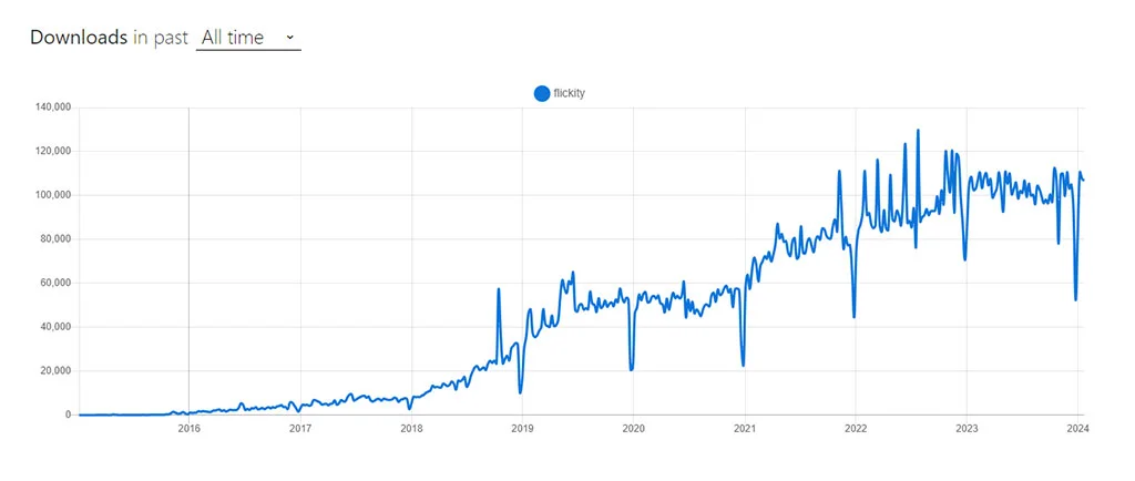
6. React Flickity: Touch-Friendly Carousel Component for React
React Flickity is a carousel component tailored for React. It enables the creation of touch-friendly, responsive carousels with customizable navigation. Originating from the JavaScript component Flickity by Desandro, it has been effectively adapted for React by third-party developers. React Flickity is known for its well-crafted design and comprehensive documentation. It offers a range of options, though it may not be as responsive as some other plugins. A standout feature is its “show on full screen” button. It is an ideal choice for projects where high-level responsiveness is not a primary concern.

Check React Flickity NPM Trends All Time Downloads graph:
7. Pure React Carousel: Uncomplicated and Flexible Carousel Library
Pure React JS Carousel is a straightforward and efficient carousel library for React. It offers a no-frills approach to carousel design. It stands out by giving you control over the dimensions of your slides. Other carousel components commonly lack this feature. Additionally, it provides the flexibility to customize the layout with CSS to suit your specific needs. Its popularity in the developer community is partly due to its unique zooming capabilities. Many other libraries lack this feature.

Check Pure React Carousel NPM Trends All Time Downloads graph:

This library is designed to be as unstyled as possible. It is similar to how a <table> element is expected to have minimal styling. This allows developers to tailor the appearance according to their vision. Furthermore, the Pure React Carousel prioritizes WCAG accessibility standards. It is an inclusive choice for web development.
8. Nuka Carousel: A Balanced React Carousel Library
Nuka Carousel stands out in the React ecosystem. It’s a carousel library that strikes an ideal balance between simplicity and functionality. It’s designed to offer an accessible and user-friendly carousel experience. It elevates the user interface on your brand’s website. Nuka Carousel comes equipped with a basic slider. It is fully customizable in both UI and behavior. It supports vertical scrolling and provides three distinct transition styles: scroll, fade, and 3D scroll. For those looking for additional functionality, there’s also an optional zoom feature that can be integrated.

Check Nuka Carousel NPM Trends All Time Downloads graph:

9. React Awesome Slider: High-Performance Full-Page Transition Component
The React Awesome Slider is a robust and flexible React component. It is specifically crafted for seamless full-page transitions. It’s engineered to deliver a smooth, 60fps experience, ensuring high performance. The component is ready for production use. It stands out for its extensive customization possibilities. Ideal for rendering both image and video galleries, the React Awesome Slider offers an effective and adaptable approach to creating sliders or carousels in your applications.

Check React Awesome Slider NPM Trends All Time Downloads graph:

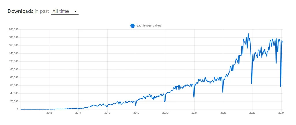
10. React Image Gallery: Distinctive Carousel Component for React
React Image Gallery sets itself apart in the realm of React UI component libraries. This carousel component is specially designed to craft image galleries and carousels with a range of features. It supports mobile swipe gestures, thumbnail navigation, full-screen capabilities, and custom slide rendering. It also supports Right-to-Left (RTL) and responsive design. This library is unique because it offers options like pagination display. It also has a ‘show on full screen’ icon tailored for galleries. Additionally, it lets you add thumbnails to the carousel’s core. Additionally, it caters to RTL navigation preferences. React Image Gallery also includes several render functions, allowing for customized creation of elements like navigation buttons, play/pause controls, and individual carousel items.

Check React Image Gallery NPM Trends All Time Downloads graph:
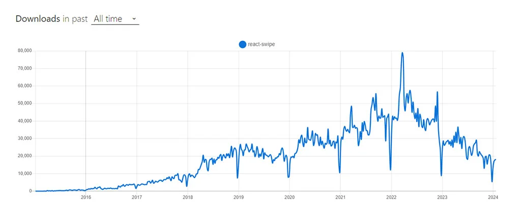
11. React Swipe: Lightweight Carousel Component for Touch-Enabled Devices
React Swipe is a streamlined version of the Swipe.js carousel library, tailored specifically for ReactJS. It’s a lightweight option that focuses on simplifying the carousel experience for touch-enabled devices, offering helpful configuration options. React Swipe is designed for touch-enabled devices that do not support mouse dragging. If your priority is to cater to the simplicity and ease of use on touch devices, React Swipe is an optimal choice.

Check React Swipe NPM Trends All Time Downloads graph:
12. React Id Swiper: A React Wrapper for Swiper.js
React Id Swiper serves as a bridge, bringing the capabilities of Swiper.js into the React ecosystem. It transforms React Slider Swiper into a React component, complete with advanced effects like 3D Cube, Coverflow, and Flip. This library, acting as a dependency on Swiper, was created prior to the official React wrapper from Swiper.js. React Id Swiper is particularly designed to enhance the mobile user experience, making it ideal for mobile websites, web apps, and native or hybrid mobile applications. It’s compatible with iOS, Android, Windows Phone, and modern web browsers. Since it’s essentially a wrapper for Swiper, it inherits all the configurable options, events, and methods of the original component, maintaining consistency and versatility.
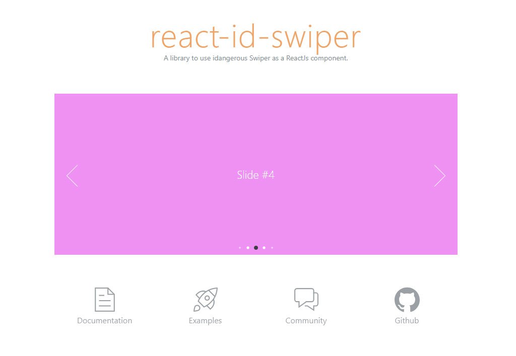
Check React Id Swiper NPM Trends All Time Downloads graph:
13. React Owl Carousel: A Versatile and User-Friendly Carousel Component
React Owl Carousel stands out as a top choice for crafting highly adaptable and responsive carousels in React projects. It incorporates touch and drag capabilities, delivering an engaging user experience. This component acts as a React wrapper for the well-known jQuery plugin, Owl Carousel, effectively merging the strengths of React and jQuery. Although it depends on jQuery, which some might consider a bit traditional, React Owl Carousel is still a strong and reliable choice. It boasts a plethora of features like responsive settings, URL hashing, lazy loading, autoplay, and drag functionality. These attributes ensure smooth integration and significantly boost user interaction on your website.
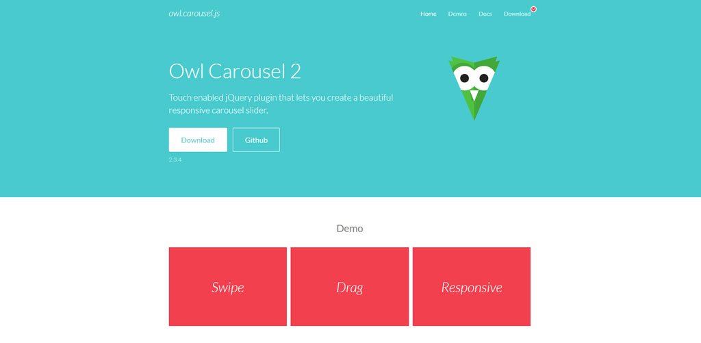
Check React Owl Carousel NPM Trends All Time Downloads graph:

14. React Alice Carousel: Smooth and Customizable Carousel Library
React Alice Carousel is an exceptional choice among carousel component libraries. It’s known for its fluid swipe functionality. It’s equipped with features such as responsive design and autoplay functionality. It also has elegant fade animations, Right-to-Left (RTL) support, and drag capabilities. These make it ideal for crafting attractive, mobile-responsive content galleries. With advanced React rendering capabilities, it allows for detailed customization. This includes displaying multiple items per slide and tailoring navigation elements. These features combined make React Alice Carousel a superb option for those looking to develop visually appealing and interactive carousels in React applications.

Check React Alice Carousel NPM Trends All Time Downloads graph:

15. React-elastic-carousel: Flexible and Customizable Carousel Component
React-elastic-carousel is a powerful and adaptable React carousel component, ideal for designing sliders or carousels in React-based applications. Its versatility and range of customization options make it easy to present content items in a fluid, sliding format, be it horizontally or vertically. This library offers the freedom to tailor and create attractive, interactive carousels that seamlessly integrate with your specific design and functional needs.
Check React-elastic-carousel NPM Trends All Time Downloads graph:

Creating a Simple Image Carousel in React: A Step-by-Step Guide
After exploring the top React Carousel Component Libraries, it’s time to dive into a practical guide. We’ll walk you through a straightforward tutorial on how to construct a basic image carousel in React. This step-by-step approach will provide you with the essentials to get started with your image carousel project in React.
Step 1: Initiating Your React Project
To begin your new React project, utilize tools such as Create React App. This tool efficiently generates a basic project structure, simplifying the initial setup process.
Step 2: Install Necessary Dependencies
Once your project setup is complete, proceed to install the essential dependencies. This is done by executing a specific command within your project directory.
npm install react-slick slick-carousel
Step 3: Crafting the Carousel Component
Begin by creating a new file named ‘Carousel.js’ in your project. This file will house the basic framework of your carousel component. Start by importing all the necessary dependencies into this file.
import React from 'react';
import Slider from 'react-slick';

const Carousel = ({ slides }) => {
// Implement carousel functionality here

return (
<Slider {...settings}>
{/* Render slides here */}
</Slider>
);
}

export default Carousel;
Step 4: Slide Information Set Up
Prepare the data for your slides. This can be done either by creating a separate file or directly within your carousel component. Ensure each slide object includes essential details like image URLs, captions, or any other content you wish to showcase.
Step 5: Developing Carousel Features
Within your Carousel.js component, establish the core functionality of the carousel. This involves importing and applying the appropriate settings and styles from react-slick, tailored to your specific needs. For instance:
const Carousel = ({ slides }) => {
const settings = {
dots: true,
infinite: true,
speed: 500,
slidesToShow: 1,
slidesToScroll: 1,
};

return (
<Slider {...settings}>
{slides.map((slide, index) => (
<div key={index}>
<img src={slide.image} alt={slide.caption} />
<p>{slide.caption}</p>
</div>
))}
</Slider>
);
}
Step 6: Displaying the Carousel
Within the main component of your application, ensure to import the Carousel component. Then, provide the slide data to it by passing this information as a prop:
import React from 'react';
import Carousel from './Carousel';
import slideData from './slideData';

const App = () => {
return (
<div className="App">
<h1>Image Carousel</h1>
<Carousel slides={slideData} />
</div>
);
}

export default App;
Step 7: Customizing Carousel Appearance
Enhance the visual appeal of your carousel by applying custom styles. This can be achieved through traditional CSS rules or by adopting a CSS-in-JS approach, such as utilizing styled-components for more dynamic styling options.
Step 8: Launch and Evaluate Your Carousel
After saving all your modifications, initiate your React development server and launch your application in a web browser. You should now observe your image carousel in action, showcasing the slides based on the data you’ve inputted.
While this guide employs the react-slick library, feel free to select any from the previously mentioned React JS Carousel Component Libraries to construct your carousel. Dive into the react-slick documentation and samples for further customization options, such as adding navigation controls, implementing autoplay, or integrating additional features to enrich your carousel’s functionality and user experience.
Conclusion
Wrapping up our journey through the realm of Top React Carousel Component Libraries and their prevalent trends, we’ve aimed to shed light on the most favored options among product managers and developers. While each ReactJS Carousel Component we discussed provides the essential carousel functionality, selecting the perfect fit for your project hinges on your specific needs and goals. For business owners navigating the complexities of choosing the right Carousel Component Library for their upcoming project, partnering with a React JS Development Company like WEDOWEBAPPS can be a game-changer. Such collaboration offers invaluable insights into the practical applications and distinctive features of each carousel component, guiding you to make an informed decision and seamlessly integrating it into your next venture.