Introduction
A few years ago, businesses selected Java frameworks mainly based on developer familiarity and community popularity. Today, the decision carries much higher stakes.
The framework you choose can influence how quickly your product reaches the market, how well your application handles scaling, how easily your systems integrate with cloud infrastructure, and how expensive your platform becomes to maintain over time. For startups racing toward product-market fit, enterprises modernizing legacy systems, and SaaS companies preparing for rapid user growth, choosing the wrong framework can create long-term operational and development challenges that are difficult to reverse later.
Modern application development has evolved dramatically. Businesses are now building cloud-native platforms, microservices architectures, AI-powered systems, real-time applications, and highly scalable enterprise solutions that demand speed, flexibility, security, and performance from the very beginning.
This is where Java continues to stand out. Despite the rise of newer programming ecosystems, Java remains one of the most trusted technologies for enterprise-grade software development. Its mature ecosystem, massive developer community, strong security capabilities, and long-term scalability make it a preferred choice for companies building reliable and future-ready applications. However, with so many popular Java frameworks available today, selecting the best Java framework for web development or enterprise applications is no longer straightforward.
Some Java frameworks prioritize rapid development and faster MVP launches. Others are optimized for microservices, Kubernetes environments, cloud-native deployment, or high-performance enterprise systems. A framework that works perfectly for a lightweight startup application may not be suitable for a complex enterprise platform managing millions of requests, integrations, and transactions daily.
That is why businesses today evaluate Java frameworks strategically, not just technically.
Instead of simply asking, “Which framework is popular?”, decision-makers now ask:
- Which Java framework scales best for enterprise applications?
- Which framework supports microservices and cloud-native architecture?
- Which option reduces long-term maintenance costs?
- Which framework accelerates development without sacrificing performance?
- Which Java framework is best for modern web development and APIs?
In this guide, we will compare the best Java frameworks for web development and enterprise applications, including their strengths, limitations, ideal use cases, and business suitability. Whether you are building a scalable SaaS product, modernizing enterprise infrastructure, or planning a high-performance backend system, this Java frameworks comparison will help you choose the right technology foundation for long-term growth.

Why Java Framework Selection Matters for Businesses
Choosing the right Java framework is no longer just a technical decision — it directly impacts development speed, scalability, security, maintenance costs, and long-term business growth.
While many frameworks may appear similar during the early development stage, the differences become more visible as applications scale. A framework that works well for a small MVP may struggle with enterprise traffic, cloud-native deployment, complex integrations, or long-term maintenance requirements.
This is why businesses evaluating the best Java frameworks now focus on long-term architectural fit instead of simply choosing the most popular option.
For startups and SaaS businesses, the right framework can help:
- Launch products faster
- Reduce development complexity
- Scale applications efficiently
- Support cloud-native growth
For enterprises, framework selection becomes critical for:
- Scalability
- Security
- Microservices support
- Third-party integrations
- Long-term maintainability
Modern Java frameworks for enterprise applications are also evaluated based on their compatibility with Kubernetes, cloud infrastructure, distributed systems, and API-first architectures.
Ultimately, the right framework should not only support current development needs but also align with the business’s long-term growth strategy.
What Makes a Java Framework “Best” in 2026?

With so many popular Java frameworks available today, businesses no longer choose a framework based only on popularity or developer preference. The best Java frameworks for web development and enterprise applications are now evaluated based on how well they support scalability, cloud infrastructure, performance, security, and long-term maintainability.
A framework that works well for a small internal application may not always be suitable for enterprise-scale systems, cloud-native platforms, or high-traffic digital products. This is why businesses compare Java frameworks using multiple technical and operational criteria before making a long-term development decision.
Scalability
Scalability remains one of the most important factors when evaluating Java frameworks for enterprise applications.
Modern applications are expected to support:
- Enterprise traffic growth
- Large databases
- Real-time processing
- Distributed systems
- Multi-service architectures
Businesses usually prefer frameworks that can scale efficiently without affecting application stability or performance as the product grows.
Development Speed
Faster development cycles directly impact product launches and time-to-market. Businesses often prioritize Java frameworks that offer:
- Reduced boilerplate coding
- Built-in tooling
- Faster API development
- Easier configurations management
- Simplified dependency handling
Frameworks that improve developer productivity help businesses accelerate application development while reducing engineering complexity.
Microservices Support
Modern application architecture increasingly relies on microservices and cloud-native deployment models.
This is why businesses evaluate frameworks based on:
- Kubernetes readiness
- Container compatibility
- Distributed architecture support
- API-first development capabilities
Frameworks optimized for microservices generally perform better in scalable and cloud-native environments.
Security Features
Security remains one of the biggest reasons Java continues to dominate enterprise software development. Businesses often compare Java frameworks based on:
- Authentication capabilities
- Authorization management
- API security
- Dependency ecosystem maturity
- Long-term security support
This becomes especially important for industries handling sensitive customer, financial, or operational data.
Performance and Resource Efficiency
Application performance directly affects both user experience and infrastructure costs.
Businesses typically evaluate Java frameworks based on:
- Startup speed
- Memory consumption
- Runtime efficiency
- Response handling performance
Lightweight and optimized frameworks are becoming increasingly important for modern cloud deployments and high-performance APIs.
Community and Ecosystem Support
A strong ecosystem often determines how sustainable a framework becomes over time.
Widely adopted Java frameworks usually provide:
- Better documentation
- Long-term support
- Larger developer communities
- Easier talent availability
- Frequent updates and improvements
For growing businesses, strong ecosystem support helps reduce long-term maintenance challenges and hiring difficulties.
Enterprise Integration Capabilities
Modern business applications rarely operate independently. The best Java frameworks should integrate efficiently with:
- Databases
- APIs
- Cloud services
- Enterprise platforms
- Legacy systems
Integration flexibility becomes especially important for enterprises modernizing existing infrastructure or building connected digital ecosystems.
Ultimately, the best Java framework is the one that aligns with your application architecture, scalability goals, infrastructure requirements, and long-term business strategy.
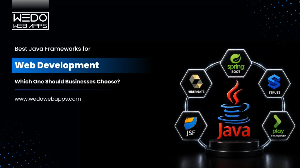
Quick Comparison of the Best Java Frameworks
Before choosing a framework, businesses often compare popular Java frameworks based on scalability, cloud compatibility, performance, development speed, and enterprise readiness. While some frameworks are better suited for rapid MVP development, others are designed specifically for enterprise applications, microservices, or cloud-native systems.
The table below provides a quick Java frameworks comparison to help businesses understand where each framework performs best.
| Java Framework | Best For | Architecture Focus | Scalability | Development Speed | Cloud-Native Support |
|---|---|---|---|---|---|
| Spring Boot | Enterprise applications, scalable APIs | Microservices & enterprise systems | High | High | Excellent |
| Hibernate | Database-heavy applications | ORM & persistence management | High | Medium | Moderate |
| Micronaut | Cloud-native and serverless apps | Lightweight microservices | High | High | Excellent |
| Quarkus | Kubernetes and containerized deployments | Cloud-native architecture | High | High | Excellent |
| Grails | Rapid application development | Convention-over-configuration | Moderate | Excellent | Moderate |
| Play Framework | Reactive and real-time applications | Reactive architecture | High | High | High |
| Apache Struts | Legacy enterprise systems | MVC architecture | Moderate | Medium | Limited |
| Vaadin | Enterprise UI applications | Component-based UI development | Moderate | High | Moderate |
| Dropwizard | RESTful APIs and backend services | Lightweight service architecture | High | High | High |
| JavaServer Faces (JSF) | Enterprise portals and dashboards | Component-based enterprise UI | Moderate | Medium | Limited |
While this comparison provides a quick overview, the right framework ultimately depends on the application’s architecture, scalability goals, cloud strategy, and long-term business requirements.
In the following sections, we will explore each of these top Java frameworks for web development and enterprise applications in detail, including their strengths, limitations, ideal use cases, and business suitability.
Top Java Frameworks for Web Development

Spring Boot: The Most Popular Java Framework for Enterprise Applications
Spring Boot is widely considered one of the best Java frameworks for web development and enterprise applications. It simplifies enterprise Java development by reducing configuration complexity and accelerating backend development.
Built on top of the Spring ecosystem, Spring Boot helps businesses develop scalable applications faster through:
- Auto-configuration
- Embedded servers
- Dependency management
- Rapid API development
- Microservices support
This is one of the main reasons startups, SaaS companies, and enterprises continue using Spring Boot for modern application development.
Why Businesses Choose Spring Boot
- Enterprise web applications
- SaaS platform development
- RESTful APIs
- Microservices architecture
- Cloud-native applications
- eCommerce and fintech platforms
It integrates efficiently with Kubernetes, Docker, cloud infrastructure, and distributed systems, making it highly suitable for scalable enterprise applications.
Key Advantages of Spring Boot
- Faster Development: Spring Boot reduces boilerplate coding and simplifies application setup, helping businesses reduce development time and accelerate product launches.
- Strong Microservices Support: Its compatibility with cloud-native architecture and containerized environments makes it one of the most preferred Java frameworks for microservices.
- Enterprise-Grade Security: Spring security allows businesses to implement authentication, authorization, and API security efficiently.
- Large Ecosystem: Spring Boot offers strong community support, extensive documentation, long-term stability, and easier developer availability.
Limitations of Spring Boot
Despite its advantages, Spring Boot may:
- Consume higher memory
- Have slower startup times than lightweight frameworks
- Feel complex for smaller applications
This is why some businesses prefer Micronaut or Quarkus for lightweight cloud-native deployments.
Best For
Spring Boot is best suited for businesses building:
- Scalable enterprise applications
- Cloud-native platforms
- Enterprise APIs
- Microservices ecosystems
- Long-term backend systems

2. Micronaut: A Lightweight Java Framework for Cloud-Native Applications
Micronaut has become one of the fastest-growing Java frameworks for businesses building lightweight, cloud-native, and microservices-based applications. Unlike traditional frameworks that consume higher memory and slower startup times, Micronaut is designed specifically for modern distributed systems and containerized environments.
Its low memory consumption and fast startup performance make it highly suitable for:
- Microservices architecture
- Serverless applications
- Cloud-native platforms
- High-performance APIs
This is one reason many startups and SaaS companies now consider Micronaut among the best Java frameworks for modern web development.
Why Businesses Choose Micronaut
Micronaut is optimized for:
- Kubernetes deployments
- Docker containers
- Reactive applications
- Serverless infrastructure
- Cloud scalability
Its compile-time dependency injection reduces runtime overhead, helping applications perform more efficiently in cloud environments.
Key Advantages of Micronaut
- Faster Startup and Lower Memory Usage: Micronaut is designed for lightweight deployments, making it ideal for modern cloud infrastructure and serverless applications.
- Strong Cloud-Native Support: It integrates efficiently with Kubernetes, microservices ecosystems, and distributed application environments.
- Improved Performance Efficiency: Its reduced runtime overhead helps businesses optimize infrastructure usage and application performance.
- Modern Development Architecture: Micronaut supports reactive programming, API-first development, and modern distributed systems.
Limitations of Micronaut
Despite its advantages, Micronaut may:
- Have a smaller ecosystem compared to Spring Boot
- Offer fewer third-party integrations
- Require a learning curve for teams familiar with traditional Spring architecture
Best For
Micronaut is best suited for businesses building:
- Cloud-native applications
- Lightweight microservices
- Serverless platforms
- High-performance APIs
- Scalable SaaS products
3. Quarkus: A Modern Java Framework for Kubernetes and Containerized Applications
Quarkus is one of the most popular Java frameworks for businesses building cloud-native and container-first applications. Designed specifically for Kubernetes and modern cloud environments. Quarkus focuses heavily on faster startup times, lower memory usage, and high-performance microservices architecture.
It is often preferred by businesses developing:
- Containerized applications
- Microservices platforms
- Cloud-native systems
- Serverless applications
- High-performance backend services
Its strong integration with GraalVM also helps optimize Java applications for modern infrastructure environments.
Why Businesses Choose Quarkus
Quarkus is built for modern deployment ecosystems, including:
- Kubernetes
- Docker containers
- Serverless infrastructure
- Distributed systems
- API-first architecture
Its lightweight runtime performance makes it highly suitable for businesses looking to reduce infrastructure overhead while maintaining scalability.
Key Advantages of Quarkus
- Optimized for Kubernetes: Quarkus is specifically designed for Kubernetes-native development, making deployment and scaling more efficient in containerized environments.
- Faster Startup Performance: Compared to traditional enterprise Java frameworks, Quarkus offers significantly faster startup times and lower memory consumption.
- Strong Microservices Support: Its architecture works well for distributed systems and cloud-native microservices applications.
- Developer-Friendly Ecosystem: Quarkus supports popular Java standards and integrates efficiently with existing enterprise Java tools and libraries.
Limitations of Quarkus
Despite its advantages, Quarkus may:
- Have a smaller ecosystem compared to Spring Boot
- Require additional learning for traditional Java teams
- Be less suitable for highly traditional monolithic enterprise applications
Best For
Quarkus is best suited for businesses building:
- Kubernetes-based applications
- Cloud-native platforms
- Containerized enterprise systems
- Microservices ecosystems
- High-performance backend applications
4. Hibernate: The Most Popular Java Framework for Database Management
Hibernate is one of the most widely used Java frameworks for database management and object-relational mapping (ORM). It simplifies how Java applications interact with databases by reducing the need for complex SQL queries and manual database handling.
Instead of writing extensive database code, developers can manage data using Java objects, which helps accelerate development and improve maintainability.
Because of its strong persistence management capabilities, Hibernate is commonly used in:
- Enterprise applications
- Database-heavy systems
- ERP and CRM platforms
- Banking and financial applications
- Large-scale business platforms
Why Businesses Choose Hibernate
Hibernate helps businesses simplify:
- Database operations
- Data persistence
- Query management
- Database portability
- Transaction handling
It also integrates efficiently with enterprise Java frameworks like Spring Boot, making it highly suitable for scalable enterprise applications.
Key Advantages of Hibernate
- Reduced Database Complexity: Hibernate minimizes manual SQL coding and simplifies database interaction for development teams.
- Database Flexibility: It supports multiple relational databases, helping businesses maintain flexibility across infrastructure environments.
- Better Development Efficiency: Automatic mapping between Java objects and database tables improves productivity and reduces repetitive coding.
Limitations of Hibernate
Despite its advantages, Hibernate may:
- Become complex for advanced query optimization
- Add performance overhead in certain scenarios
- Require careful configuration for large-scale systems
Best For
Hibernate is best suited for businesses building:
- Database-intensive applications
- Enterprise software
- ERP and CRM systems
- Long-term enterprise platforms
5. Grails: A Java Framework for Rapid Application Development
Grails is a high-productivity Java framework built on top of Groovy and the Spring ecosystem. It is widely known for simplifying application development through convention-over-configuration, allowing development teams to build applications faster with less boilerplate code.
Because of its rapid development capabilities, Grails is often preferred for:
- MVP development
- Startup applications
- Business management systems
- Internal enterprise tools
- Content-driven platforms
For businesses focused on faster product launches, Grails can significantly reduce development time and complexity.
Why Businesses Choose Grails
Grails simplifies backend development through:
- Built-in development tools
- Faster configuration
- Rapid CRUD operations
- Seamless Spring integration
- Simplified database handling
Its developer-friendly architecture makes it useful for businesses looking to accelerate application delivery.
Key Advantages of Grails
- Faster Development Cycles: Convention-over-configuration reduces repetitive setup and speeds up application development.
- Strong Spring Ecosystem Integration: Grails benefits from the scalability and flexibility of the Spring ecosystem.
- Simplified Development Experience: Its built-in tooling and Groovy support help reduce coding complexity for many business applications.
Limitations of Grails
Despite its advantages, Grails may:
- Be less suitable for highly complex enterprise systems
- Have lower adoption compared to Spring Boot
- Require Groovy familiarity for efficient development
Best For
Grails is best suited for businesses building:
- MVPs and startup products
- Internal enterprise tools
- Rapid development projects
- Content and workflow management systems
6. Play Framework: A Java Framework for Reactive and Real-Time Applications
Play Framework is a lightweight and reactive Java framework designed for high-performance web applications and real-time systems. It is known for supporting asynchronous processing and non-blocking architecture, making it suitable for applications that require speed, scalability, and high concurrency.
Businesses often use Play Framework for:
- Real-time applications
- Streaming platforms
- Chat and messaging systems
- High-traffic web applications
- Reactive APIs
Its developer-friendly architecture and modern design make it one of the more flexible Java frameworks for scalable web development.
Why Businesses Choose Play Framework
Play Framework is built for reactive application development and works efficiently for systems handling large numbers of simultaneous requests.
It supports:
- Asynchronous processing
- Stateless architecture
- RESTful API development
- Reactive programming
- Scalable backend systems
This makes it useful for businesses building performance-focused digital platforms.
Key Advantages of Play Framework
- High Performance: Its non-blocking architecture helps applications manage heavy traffic and concurrent requests more efficiently.
- Reactive Application Support: Play Framework is well-suited for modern reactive and event-driven systems.
- Faster Development: Hot reloading and simplified development workflows improve developer productivity.
Limitations of Play Framework
Despite its advantages, Play Framework may:
- Have a smaller ecosystem compared to Spring Boot
- Require reactive programming expertise
- Be less preferred for highly traditional enterprise systems
Best For
Play Framework is best suited for businesses building:
- Real-time applications
- High-concurrency platforms
- Streaming systems
- Reactive web applications
- Scalable APIs
7. Dropwizard: A Lightweight Java Framework for RESTful APIs
Dropwizard is a lightweight Java framework designed for building high-performance RESTful web services and backend APIs. It combines several stable Java libraries into a simple development stack, helping businesses create production-ready applications with minimal configuration.
Because of its simplicity and operational efficiency, Dropwizard is commonly used for:
- REST APIs
- Backend microservices
- Internal business services
- High-performance web services
- Lightweight enterprise applications
It is especially useful for businesses that want faster backend development without the complexity of larger enterprise frameworks.
Why Businesses Choose Dropwizard
Dropwizard focuses heavily on operational simplicity and performance.
It offers:
- Embedded Jetty server support
- Simplified REST API development
- Built-in metrics and monitoring
- Fast application setup
- Lightweight architecture
This makes it a practical choice for businesses building API-centric applications and backend systems.
Key Advantages of Dropwizard
- Lightweight and Fast: Dropwizard reduces unnecessary complexity and helps developers build performant backend services quickly.
- Built-In Operational Tools: It includes monitoring, logging, and metrics capabilities that simplify production management.
- Strong REST API Support: Its architecture is optimized for scalable and efficient RESTful web service development.
Limitations of Dropwizard
Despite its advantages, Dropwizard may:
- Offer fewer enterprise features compared to Spring Boot
- Be less flexible for highly complex systems
- Have a smaller ecosystem and community
Best For
Dropwizard is best suited for businesses building:
- RESTful APIs
- Lightweight backend services
- Microservices
- High-performance web services
- Operationally simple applications
8. Apache Struts: A Traditional Java Framework for Legacy Enterprise Applications
Apache Struts is one of the older and more established Java frameworks used for enterprise web application development. Based on the MVC (Model-View-Controller) architecture, it was widely adopted for large-scale enterprise systems before modern frameworks like Spring Boot became dominant.
Although its popularity has declined in recent years, many enterprises still maintain legacy applications built with Struts.
Why Businesses Still Use Apache Struts
Apache Struts is commonly found in:
- Legacy enterprise systems
- Government applications
- Large internal business platforms
- Older banking and insurance software
For businesses managing long-running enterprise applications, migrating away from Struts may require significant redevelopment effort.
Key Advantages of Apache Struts
- Structured MVC Architecture: Struts helped standardize enterprise Java web development through MVC-based application organization.
- Stable for Existing Enterprise Systems: Many businesses continue using Struts for maintaining stable legacy applications.
Limitations of Apache Struts
Despite its historical importance, Apache Struts:
- Feels outdated compared to modern Java frameworks
- Has limited cloud-native support
- Requires more configuration and manual setup
- Is less suitable for modern microservices architecture
Best For
Apache Struts is best suited for:
- Maintaining legacy enterprise applications
- Supporting older Java web systems
- Gradual modernization projects
9. Vaadin: A Java Framework for Enterprise UI Development
Vaadin is a Java framework focused on building interactive user interfaces for enterprise web applications. Unlike many backend-focused Java frameworks, Vaadin allows developers to create modern web interfaces using Java instead of extensive frontend JavaScript frameworks.
It is commonly used for:
- Enterprise dashboards
- Internal business applications
- Admin panels
- CRM and ERP interfaces
- Data-driven enterprise platforms
Because of its component-based architecture, Vaadin is often preferred by businesses developing secure and structured enterprise applications.
Why Businesses Choose Vaadin
Vaadin simplifies enterprise UI development through:
- Reusable UI components
- Java-based frontend development
- Faster enterprise dashboard creation
- Built-in UI management
- Strong backend integration
This helps businesses build internal tools and enterprise platforms with less frontend complexity.
Key Advantages of Vaadin
- Faster Enterprise UI Development: Pre-built components help accelerate dashboard and business application development.
- Strong Java Ecosystem Integration: Vaadin works efficiently with Spring Boot and other enterprise Java technologies.
- Simplified Frontend Management: Businesses can manage frontend and backend development more efficiently within the Java ecosystem.
Limitations of Vaadin
Despite its advantages, Vaadin may:
- Be less flexible for highly custom frontend experiences
- Feel heavier compared to lightweight frontend frameworks
- Be less suitable for consumer-focused web applications
Best For
Vaadin is best suited for businesses building:
- Enterprise dashboards
- Internal business tools
- ERP and CRM interfaces
- Administrative web applications
10. JavaServer Faces (JSF): A Component-Based Java Framework for Enterprise Applications
JavaServer Faces (JSF) is a component-based Java framework used for building structured enterprise web applications and user interfaces. It simplifies UI development through reusable components and server-side rendering, making it useful for traditional enterprise systems.
JSF has been widely used in:
- Enterprise portals
- Government systems
- Internal business applications
- Administrative dashboards
- Large enterprise workflows
Although newer frontend technologies have reduced its popularity, many enterprises still use JSF for maintaining stable business applications.
Why Businesses Choose JSF
JSF helps businesses build structured enterprise applications through:
- Reusable UI components
- Server-side UI management
- Simplified form handling
- Enterprise Java integration
- MVC-based architecture
Its integration with Java EE technologies makes it suitable for traditional enterprise environments.
Key Advantages of JSF
- Component-Based Development: Reusable UI components help standardize enterprise application interfaces.
- Enterprise Integration: JSF works efficiently with enterprise Java technologies and large business systems.
- Long-Term Stability: Many enterprises continue using JSF for maintaining stable and process-driven applications.
Limitations of JSF
Despite its enterprise adoption, JSF may:
- Feel outdated compared to modern frontend frameworks
- Require more configuration and server resources
- Be less suitable for highly interactive modern web applications
Best For
JSF is best suited for businesses building:
- Enterprise portals
- Administrative systems
- Internal business platforms
- Traditional enterprise web applications
Best Java Frameworks Based on Business Use Cases
Choosing the best Java framework depends heavily on the type of application a business plans to build. A framework that works well for rapid MVP development may not always be ideal for enterprise-scale systems or cloud-native applications.
This is why businesses often compare Java frameworks based on specific project goals, scalability requirements, and infrastructure needs rather than choosing a framework solely based on popularity.
Best Java Framework for Enterprise Applications
For large-scale enterprise systems, Spring Boot remains one of the strongest choices because of its:
- Scalability
- Security ecosystem
- Microservices support
- Enterprise integration capabilities
- Long-term maintainability
It is widely used for banking platforms, SaaS ecosystems, ERP systems, and enterprise APIs.
Best Java Framework for Cloud-Native Applications
Micronaut and Quarkus are among the best Java frameworks for cloud-native development.
Both frameworks are optimized for:
- Kubernetes
- Docker containers
- Lightweight deployments
- Faster startup times
- Lower memory consumption
They are highly suitable for businesses building scalable cloud platforms and microservices ecosystems.
Best Java Framework for Rapid Application Development
Grails is often preferred for faster MVP development and rapid product launches.
Its convention-over-configuration approach helps businesses:
- Reduce development complexity
- Build applications faster
- Accelerate time-to-market
This makes it useful for startups and businesses to validate new product ideas quickly.
Best Java Framework for REST APIs and Backend Services
Dropwizard and Spring Boot are widely used for RESTful APIs and backend systems.
Businesses often choose these frameworks for:
- API-first development
- Backend microservices
- High-performance web services
- Scalable backend infrastructure
Best Java Framework for Database-Heavy Applications
Hibernate remains one of the most popular Java frameworks for managing complex database operations and enterprise persistence layers.
It is highly suitable for:
- ERP systems
- CRM platforms
- Financial applications
- Data-intensive enterprise software
Best Java Framework for Real-Time Applications
Play Framework is well-suited for reactive and high-concurrency systems.
Businesses often use it for:
- Streaming platforms
- Messaging systems
- Real-time applications
- Event-driven architectures
Best Java Framework for Enterprise UI Applications
Vaadin and JSF are commonly used for:
- Enterprise dashboards
- Administrative systems
- Internal business applications
- ERP and CRM interfaces
These frameworks simplify structured UI development for enterprise environments.
Ultimately, the best Java framework for web development depends on your:
- Application architecture
- Scalability goals
- Cloud strategy
- Development timeline
- Long-term business requirements
The right framework should align not only with technical requirements but also with future business growth plans.

How to Choose the Right Java Framework for Your Project
Choosing from the best Java frameworks becomes easier when businesses evaluate their actual project requirements instead of following trends or popularity alone. The right framework should support your current development goals while also preparing the application for future scalability and operational growth.
Before making a decision, businesses should evaluate the following factors.
1. Define Your Application Type
Start by identifying what kind of application you are building.
For example:
- Enterprise platforms may require scalability and security
- SaaS products may prioritize cloud-native architecture
- MVPs may need a faster development speed
- Real-time applications may require a reactive architecture
Your application type often determines which Java framework will be the most practical long-term choice.
2. Evaluate Scalability Requirements
Businesses expecting rapid growth should prioritize frameworks that support:
- Distributed systems
- Microservices architecture
- Cloud-native deployment
- High traffic handling
- Containerized infrastructure
Frameworks like Spring Boot, Micronaut, and Quarkus are often preferred for scalable backend ecosystems.
3. Consider Development Speed
If faster product launches are a priority, businesses should evaluate frameworks that reduce development complexity through:
- Built-in tooling
- Faster setup
- Reduced boilerplate coding
- Pre-configured components
This becomes especially important for startups and MVP-focused projects.
4. Assess Cloud and Infrastructure Compatibility
Modern applications increasingly rely on:
- Kubernetes
- Docker
- Cloud services
- API-first architecture
Choosing a framework compatible with modern infrastructure environments helps businesses scale applications more efficiently in the future.
5. Review Security and Maintenance Needs
Enterprise applications often require:
- Authentication systems
- Authorization management
- API security
- Long-term framework support
- Stable ecosystems
Businesses should evaluate how well a framework supports long-term security and maintainability.
6. Match the Framework with Team Expertise
Development efficiency also depends on team familiarity and ecosystem maturity.
Widely adopted frameworks usually offer:
- Easier hiring opportunities
- Better documentation
- Strong community support
- Faster onboarding
This can significantly reduce long-term operational and development challenges.
Ultimately, the best Java framework for enterprise applications or modern web development is the one that aligns with your business goals, scalability expectations, development timeline, and future technology roadmap.
Common Mistakes Businesses Make When Choosing Java Frameworks

Choosing the wrong Java framework can create long-term scalability, maintenance, and performance challenges for businesses. While many companies focus heavily on development speed or framework popularity, they often overlook factors that become critical as the application grows.
Here are some of the most common mistakes businesses make during Java framework selection.
Choosing a Framework Based on Popularity
One of the biggest mistakes businesses make is selecting a framework simply because it is widely used.
A popular framework is not always the right fit for every application. Businesses should evaluate whether the framework aligns with:
- Project complexity
- Scalability requirements
- Infrastructure plans
- Long-term business goals
Ignoring Future Scalability
Many applications work efficiently during the early stages but struggle as traffic, integrations, and data volume increase.
Businesses often underestimate future requirements related to:
- Microservices architecture
- Distributed systems
- Cloud-native deployment
- High user traffic
Choosing a framework without scalability planning can eventually lead to expensive architectural changes.
Prioritizing Short-Term Development Over Long-Term Maintenance
Some frameworks help accelerate early development but become difficult to maintain later.
Businesses should evaluate:
- Ecosystem maturity
- Community support
- Upgrade flexibility
- Long-term framework stability
- Developer availability
Long-term maintainability is especially important for enterprise applications expected to evolve continuously.
Overengineering Small Applications
Not every application requires a highly complex enterprise architecture.
Businesses sometimes choose heavy frameworks with unnecessary complexity for:
- Small MVPs
- Internal tools
- Lightweight applications
This can increase development effort, operational overhead, and infrastructure costs unnecessarily.
Ignoring Cloud and Infrastructure Compatibility
Modern applications increasingly rely on:
- Kubernetes
- Containers
- Microservices
- Cloud services
Choosing frameworks without proper cloud-native compatibility can create deployment and scalability limitations later.
Neglecting Security Requirements
Security is often treated as a secondary concern during framework selection.
However, businesses handling customer, financial, or enterprise data should evaluate:
- Authentication support
- Authorization capabilities
- Dependency ecosystem maturity
- Long-term security updates
Ignoring these factors can create major operational and compliance risks in the future.
Ultimately, businesses should choose Java frameworks based on long-term technical alignment, scalability goals, infrastructure strategy, and future growth plans, not just short-term convenience.

Why Java Continues to Dominate Enterprise Application Development
Despite the rise of newer programming technologies and frameworks, Java continues to remain one of the most trusted choices for enterprise software development. Its scalability, security, ecosystem maturity, and long-term stability make it highly suitable for building modern business applications.
This is one of the main reasons many businesses still prefer Java frameworks for enterprise applications, cloud-native systems, and scalable backend development.
Strong Scalability and Performance
Java is designed to support large-scale and high-performance applications.
Businesses commonly use Java for:
- Enterprise platforms
- Banking systems
- SaaS products
- eCommerce application development
- High-traffic backend services
Its ability to handle distributed systems and large workloads makes it highly reliable for long-term business growth.
Mature Ecosystem and Long-Term Stability
One of Java’s biggest advantages is its mature ecosystem.
Businesses benefit from:
- Long-term framework support
- Extensive documentation
- Large developer communities
- Stable enterprise tooling
- Easier hiring opportunities
This helps reduce maintenance risks and supports long-term application scalability.
Strong Security Capabilities
Security remains a major reason enterprises continue choosing Java.
Java frameworks often provide:
- Authentication support
- Authorization management
- Secure API handling
- Enterprise-grade reliability
- Frequent security updates
This becomes especially important for industries managing sensitive business and customer data.
Cloud-Native and Modern Architecture Support
Modern Java frameworks now support:
- Kubernetes
- Docker containers
- Microservices architecture
- Reactive systems
- API-first development
This allows businesses to build cloud-native and scalable digital platforms without leaving the Java ecosystem.
Flexibility Across Business Use Cases
Java supports a wide range of business applications, including:
- Enterprise software
- Web platforms
- Mobile backend systems
- Financial applications
- ERP and CRM systems
- Real-time services
This flexibility makes Java one of the most adaptable technologies for modern software development.
Ultimately, Java continues to evolve alongside modern infrastructure and application development trends. Combined with powerful frameworks like Spring Boot, Micronaut, and Quarkus, it remains one of the best choices for businesses building scalable and future-ready applications.
Conclusion
Choosing the best Java framework is not about following trends or selecting the most popular option; it is about finding the framework that aligns with your business goals, scalability requirements, infrastructure strategy, and long-term product vision.
Some businesses may prioritize a faster MVP development, while others may need enterprise-grade scalability, cloud-native architecture, microservices support, or high-performance backend systems. This is why frameworks like Spring Boot, Micronaut, Quarkus, Hibernate, and Grails each serve different business and technical needs.
For enterprises building large-scale digital ecosystems, Spring Boot continues to remain one of the strongest choices because of its scalability, security, and mature ecosystem. Businesses focused on lightweight cloud-native applications may benefit more from Micronaut or Quarkus, while startups looking for faster development cycles often prefer Grails for rapid application development.
Ultimately, the right framework should support not only your current application requirements but also your future growth plans, infrastructure evolution, and long-term maintainability goals.
As modern businesses continue investing in scalable web applications, cloud-native systems, and enterprise software platforms, Java remains one of the most reliable technologies for building secure, high-performance, and future-ready applications.


 Sharing Project Details
 Let's have a call
 Got Questions? Let’s Chat!