skip to content

Website Usability – Definition, Importance, and Tips to Improve

With the search engines updating their algorithms constantly, it is essential for business owners to focus on the core elements. These days more and more people are shifting on mobile devices from desktops. Therefore, it becomes imperative to enhance website usability. 

But first, What is actually Website Usability?

Simply put, website usability defines the website’s ability to be accessed seamlessly and efficiently on various devices. In other words, website usability is the measure of efficiency, effectiveness, and satisfaction with which the users can achieve their goals on a website. 

Since the search engines focus on providing the best user experience, it has become crucial to redesign your websites. With easy navigation, user-friendly responsive website designs, you can provide your customers with the best browsing time on your website. Whether an eCommerce business, enterprise, or brand, improving the usability of the website is the key to online success. 

When businesses improve web usability, it helps them boost their SEO practices and increase conversion rate. 

Why is Web Usability Important?

Why is Web Usability Important

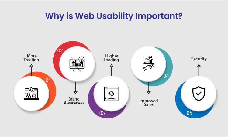
There are various benefits of improving website usability for your business to achieve success. Following are the sure-shot benefits of enhancing the usability of your website:

1. More Traction

Several businesses, usually budding startups, struggle a lot to generate more traction and traffic to their websites. The best way to overcome this is to resolve all the technical issues on your website and let more traffic come in. Since the search engines also focus on technically stronger websites, you will get more organic results making you more visible on the internet. 

Whether your main focus is more sales, branding, or generating traffic, enhanced usability can help you achieve your goals when you focus on more traction, the overall authority of your business increases. 

2. Brand Awareness

Many businesses these days struggle to get recognized against their competitors on the internet. This might happen because of the higher bounce rate of your website. Due to the high bounce rate, it becomes challenging for visitors to navigate through the web pages. So, with improved web usability, you can ensure a minimum bounce rate and provide a smoother browsing experience to the users. 

When you offer a good user experience to the customers, the overall branding of your website improves significantly. Whether you drive traffic from social media, website, or organic results, brand awareness will ultimately increase irrespective of any factor.

3. Higher Loading Speed

Website loading speed is the most significant running factor that affects the overall credibility of the business. To increase your website usability, ensure that your website loads faster without hassle on both desktop and mobile devices. In addition, if you are adding new web pages to your site, make sure that those pages also load faster and seamlessly. 

If you need, you can also use Google’s free website speed testing tool to check whether your website loads faster on every device or platform.

4. Improved Sales

If we talk about an eCommerce business, then website usability is the most important factor to take into account. There are many functionalities of a website that should work seamlessly in order to regain customers. 

For example, eCommerce businesses are directly connected to so many online transactions, and you need to make sure that your website works fine on all the platforms. You need to necessarily focus on website usability to significantly increase your sales. When you combine SEO tactics with website usability principles, you tend to get more sales. 

5. Security 

Security is yet another important aspect to be considered for web usability. When you ensure that your website and visitors’ personal data are safe, you gain more recognition among your competitors. Therefore, always integrate the SSL certificate and other necessary documents to give your customers the most secure user experience. 

Ensuring your customers that you care about the safety of their data will help you gain more traction and sales, thereby increasing the usability of your website. 

After knowing about the key benefits of improving the website’s usability, you might have realized how vital website usability is for your business to grow. Many web design companies worldwide will offer you the best web design services for your website development. 

Tips to Improve Website Usability 

Tips to Improve Website Usability 

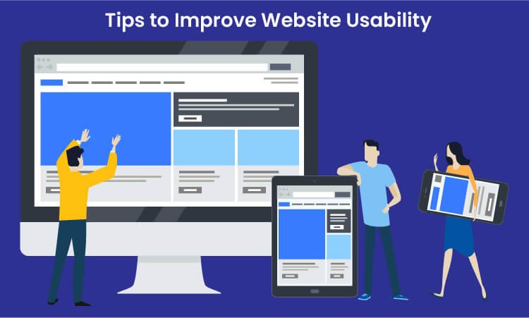
One of the greatest tips to improve website usability is to keep your website design consistent. Apart from this, there are many other tips that will help you improve the way the users interact with your website. Some of which include:

1. Strive to Have a Scannable Website content 

These Days, people are hardly free to read every single piece of content on your website. In most of the cases, customers just scan your website and find the content that is valuable to them. If they don’t see what they are looking for, they will probably not be returning back. 

The best way to improve usability is to make the website content scannable. Achieve this by using bold letters for important information and bullet points to enhance your website’s usability. Doing this will make your website easy to scan, and you will potentially gain more customers for your business. 

2. Use Good Images 

Using good images is a notable tip for increasing site usability because these help you break up the content. For example, instead of writing content for a point, try using images that add relevant information for that particular point. 

Even though images play a vital role in the website’s usability, avoid using poorly optimized images or so many images as it can compromise your site’s usability. Instead of overdoing it, use properly optimized and limited images on your website.

3. Simple and Clean Navigation

A well-functioning website can improve usability but ensure giving a simple layout to every web page. Additionally, always try to avoid horizontal scrolling as users get irritated while horizontally scrolling the websites. A responsive website that fits every screen resolution can help you avoid horizontal scrolling.

What’s more important is to avoid the use of many navigation elements. Also, don’t use so many links within the headlines as users will hardly find what they want, which will significantly impact your website’s usability. 

4. Split your Content into Heading and Subheadings 

As we said earlier, visitors hardly read all the text written on your website. Therefore, catchy headlines are the most important for your website. Writing creative headlines can be beneficial as it is the very first thing a customer notices and builds interest in reading your content. 

Apart from headings, structuring your website plays a crucial role in usability. Structuring your website with H1 and H2 tags will make your website look more appealing to your customers. It is an excellent way of resulting in long clicks and increasing engagement levels. 

5. Improve your Website’s Loading Speed 

The slow loading speed can affect your website’s usability as it can cause you to lose a potential visitor. This is because a visitor gets irritated and leaves the website before it gets loaded fully. Additionally, search engines like Google use website loading speed as a significant ranking factor. This means you will lose an opportunity to rank higher on Google, ultimately losing customers. 

Therefore, to resolve this issue, optimize your images and videos by reducing the file size before uploading them on the website. This will significantly increase your website’s loading speed. 

6. Ensure developing a Responsive Website

With an increase in the number of smartphone users, having a mobile-friendly website is not an option but a crucial part of web usability. Still, if you fail to incorporate responsiveness in your website it will affect your Google ranking and usability, thereby losing a high volume of traffic.

As you implement responsiveness to your website, ensure it maintains the same theme as the desktop version, regardless of the user’s device. For instance, the layout of a casino website will be different on both the desktop and the mobile versions. But, you need to make minor changes like changing the image size and maximum width of the page to have a responsive website. 

If you have a website and want to incorporate responsiveness or are a business looking to develop a responsive website, we can help you offer cost-effective, responsive website design services

7. Add a Homepage Link as Part of your Main Navigation

Adding a homepage link on the top of your website will increase your site’s usability as it will enable the users to access the homepage easily. Definitely, the younger professionals know that the website logo acts as a link which eliminates the need to add the homepage link. 

However, if your target audience is the older demographic, they may be confused about getting back to the homepage. If they do not see the home button, they won’t be able to recognize the logo as a link to the homepage easily. 

8. Repair Broken Links

Broken links are terrible for website usability, but the good thing is that they can be fixed easily. There are several free and paid tools on the internet that may help you find the broken links on your website, so you can check and fix them. 

9. Use Varied Multimedia

Even Though it is said that content is king, images, audios, and videos play a vital role in appealing to the customers. Deliver the content that best suits your business and your users, and remember not to forget to optimize your multimedia to increase the site’s usability. Upload the content that provides value for the users. 

10. Include Outbound Links 

Adding some outbound links to your website will make the visitors feel valuable. This will make the content more relevant and useful for the customers. Linking your content with the high authority sites will not only make your website look trustworthy but will also make your web content more meaningful and relevant. 

Now you know what you can do to improve the website’s usability. So, if you think that your website is not easily accessible for the users, implement these tips to enhance your site’s usability. 

You can achieve a clear and usable website by

  1. Simplicity – Focus more on developing simple websites. If you do not distract the customers with tacky web designs, they will likely be able to do what you want them to do on your website. 
  2. Consistency – Keep your visitors minds at ease. Maintain consistent experience across the entire website to keep them engaged with your website for a longer time. 
  3. Direct Feedback – Giving valuable feedback to any interaction is essential. The moment a visitor starts interacting with your website, give them a success or a failure indication of their actions.
  4. Familiarity – Offer your customers what they already know. Taking inspiration from your competitor’s website is nothing wrong. Even Though new things attract customers, sometimes it can even confuse the customer about what to do. Therefore, offer them something they are familiar with.
  5. Guidance – Hold your visitor’s hand. Do not expect the customers to explore your complete website on their own. Instead, give them a website tour and show them what and how you want to offer. 
  6. Good Information Architecture – Understand the mental models of your visitors. This will help you understand how the visitors want you to structure the content on your website. 

Summarizing Website Usability 

Website usability is the most significant element that cannot be achieved overnight. However, this is something every business website should primarily focus on. Avoiding website usability may cause you to drop down on the search engines and ultimately lose your potential customers. 

Achieving website usability requires hard-core research and a repetitive approach of constantly testing and enhancing. Keep the above points in mind when you start developing or optimizing your website to offer the best user experience to your customers. 

Designing an optimized website is a crucial part, but when the website is developed, website usability testing is highly recommended. If you are a non-tech geek having trouble creating or optimizing your website for usability, avail responsive web design services and let the professionals do their job. WeDoWebApps LLC has handled various design projects and can help you achieve success the way you want.

Tips for Choosing the Right company For Responsive Web Design

Too many options often create confusion, whether it’s about selecting clothes, ordering food, buying groceries or home appliances, or choosing a web design company for design services! 

The number of choices has significantly increased over the years, and the design industry is booming with the latest trends and technology. With such a highly competitive market and ample design and responsive web design companies, making a decision is a difficult task. Nevertheless, you can eliminate some points in accordance with your business requirements and include some points. To be more precise, read further and know how to choose the right responsive web design services from the pool of so many responsive web designing companies.

1. Required technologies

The first thing to contemplate is the technologies you need for your website. If it is a simple brochure site, you will not need too many features. Just one page of information and contact details are enough. However, if you need to build something with a high level of functionalities, you need to filter your requirements with priority. 

Hiring a web designer is not sufficient in such a scenario as some designers work with front-end developers exclusively, whereas some work with back-end developers. Pure-play web designers help out using Photoshop as their primary task is to focus on the branding, the feel, color palettes, and user experience. But, again, it is possible only while working with front-end developers. 

Nonetheless, it is essential to have knowledge of working with front-end and back-end developers in order to execute innovative designs. Thus, it is better to hire a web design company rather than an independent web designer. An award-winning design is always search engine friendly and search engine optimization shouldn’t hinder the  benefits of the design process.

While you look for web design services, consider things like what all functionalities you need. How often will you need to manage or edit site content? How do you want the site to grow, and how soon? Your web designing company and respective designers should be flexible, understanding, and skilled to design a site according to your business requirement.

2. Required design criteria

When you think of your website, what colors come to your mind? How does it look and feel in your imagination? You might not know this, but transforming a vague idea into an accurately designed picture-perfect website is a whole lot of tasks. Some clients articulate it better, while some have it better in their brain only.

Effective communication and brainstorming are the keys to understanding one’s design requirements. You can make a drawing with the most random colors you can come up with that shows the fundamental imaginary design. You can also enlist a few websites you really like and are compelled to have something similar but with a dash of change or modernization. 

Stay tuned with your designers while your website is under development. It is easy to point out what you do not like midway instead of after the completion of a design project. You can also bring your favorite photographs, logos, color schemes to narrate how you want to implement the design. Then, once you are specific with what you need in your plan, you can have what you want.

You can ask your designers to let you know about achievable color layouts, features, looks, and feels. Think about the most important pages of design. Do you want an update at every stage, or are you trusting enough to see the whole when it is ready? Remember to consider your budget and deadline for the project for a satisfactory outcome. 

You would come across millions of designs every day, so be sure not to change your mind and be lured to new concepts. Desktop or mobile website, ensure to have responsive websites. Do not involve your emotions and stick to the decision you have made for your website design.

3. Understand your business needs

Take this; you saw an appealing website of a Restaurant; it has enticing images, smooth navigation, and much more. Now understand, you cannot have a similar design for a site of your Yoga Studio. Your website is at the forefront of your business, and it should serve its purpose. 

We have talked about technology and design needs, and some of you may go back to the first two points but, business needs must be evaluated for website designs. Calculate your budget, how much you spend on marketing, what your targeted audience is, and what is the scope of improvement? Can you plan out to drive sales offline by just creating leads or distributing brochures? Or you can generate leads to attract customers online by visiting your website, blogs, or guest blogs.

Integrate your business needs with your design plan and explain everything to your designers. With a growing business, designers should take responsibility for using the latest trends and features to fulfill their needs. Assess your immediate future goals and mid-term needs for your business before laying a final design plan.

Think of the domain name, your emails, and online services as well. Then, create a plan for the incremental value of your business it will generate by the worth per lead it generates. Also, keep in mind to refrain from too complex designs. It may look appealing at first, but it is not worth spending money for if it interferes with seamless navigation.

Responsive website designs play a vital role in internet marketing. If you designers are unable to change your existing business methods and hinder growth, avoid them. Your designers should be able to explain how their design plan fits your business needs and how it will contribute to the company’s growth.

4. Note down your sources and alternatives

Websites with unique design concepts might be easy to find, but the designers for the same are not. The best thing is, your competitors do not know anything about it. So, all you need to do is put a little effort into finding the right team of designers or a web designing company that serves the purpose. Then, you can indeed find a great range of options without hurting your budget. 

Understand that giving a little extra money to a good designer is better than paying less money for poor quality and a long time of the procedure. Good designers would want to work with good clients. The qualities of good clients are having a clear vision of design, determination (one who does not keep changing opinions on a design and sticks to a design plan). The client should be specific with the progress a team of designers makes and cooperate with the project rather than finding faults. 

Also, prestigious designers have plenty of work, so if you are taking too much time to decide on them, they might move forward and get hired somewhere else. You will get as much return as you have put effort into. Do not expect more than what is reasonable from a person or a platform. 

Many of you might look for a local designer to whom you can talk in person. Nevertheless, a local designer might cost you more as they work in limited proximity and competition. Therefore, it is better to hire overseas resources providing full services or look for them online.

You can take references from local businesses that got their website designed from the designers they found online. They are inexpensive, and as they work with worldwide competitors, they can provide you with the best designs within your budget. 

If you are a startup or own a small business, it is okay not to spend a hefty amount on a designer website. Instead, you can opt for a simple, straightforward website that illustrates your services or products in an effective way to market them. However, do not forget that a good time spent searching for the right designer and the money invested in the same are the efforts that render fruitful results.

5. Set the budget range

You might set a budget but accept it, and it always costs a little more than the decided budget. So, set a budget in a way that going a little further won’t hurt your bank balance. You must have plenty of other expenses besides the responsive site design project. For example, you have to follow certain marketing strategies in order to boost social media marketing. Measure other expenses, and see where you can balance the usage of money. 

Think about how much money and time you are ready to spend on a website design project? It is crucial that you think of your website as an investment rather than an expense. It will change the way you approach the whole subject, which will lead you to your desired results. 

If you are thinking of having something as cheap as possible, you shouldn’t look for custom website designers. It is understandable that you want bigger returns but, for that, you should maximize your investment as well. So, first, make a note of your existing cash flow, the existing cost of a not so active website. Then, prioritize functionalities, features, and layout choices you want to include in your website design.

If you are making an investment by borrowing money or taking a loan from a bank, ensure when and how you will pay it off. Prioritizing things is essential because you cannot have everything, so be open to various options. Along with focusing on having one project and its outcomes, calculate ongoing costs of tools, staff, or designers to play safe. 

6. Creating proposals and questions

Now that you have enlisted a few designers, it’s time to make the right choice. You can send out proposals to them but, ensure to make it the right way of approach. Think of yourself as a designer and how you would like to receive proposals. Would it be a vague email asking for a web design service and its cost? Or a detailed description of the results you want to see with a fine line of budget range?

Before discussing the project, providing your budget is the simplest yet fastest way of knowing that you and the designers are on the same page. Just by telling the budget, you will know who you will talk to further about your design project. It is a way for designers to see whether you are looking for a Hyundai or Ferrari!

Make it easy for designers to talk and understand small details of your project. You can start by asking, “will you be interested to do this?” or “Do you need any other details or tools for the project?”. Take one step at a time; refrain from sending unnecessary emails or emails with fillers or too many questions. 

About questions, always ask for references; it is better to hire designers from people’s actual experience. It is more reliable that way as you can see their recent work or previous designs. Also, you can ask for their portfolio to find out if the designer has done projects similar to yours. 

Be upfront from the beginning; put your expectations and opinions from the initial days only. If the designer understands those and communicates clearly about step-by-step design progress, you are good to go. Note that communication does not improve over time, and if your designer is not on the same page as yours, things might worsen midway. Your requirements, questions, and information are your tools to understand your designer’s perspective and let them rule. 

Get expert tips on choosing the ideal responsive web design company for your business needs.

Also, evaluate the designers’ capability by their questions because, as much as your questions talk about you, their questions will tell you about them. Finally, discuss your project thoroughly and let your designers do the rest instead of making them do it back and forth.

Read also about Hire Dedicated Shopify Developers

On a final note, do not forget to request a full-fledged project plan or a contract with a substantial deadline. Stay connected with your designers by taking timely follow-ups and communicating clearly. Choosing the right website designers or responsive web design services should not be a daunting task full of unknowns and frustration. By contacting the right responsive web design agency, you can have a site that works well irrespective of desktop or mobile devices.

All you need to know is clarity of what you want, how you want, and when you want. When you decide all these, make a decision and stay firm on it. The points given above are in your best interest, and following those steps will surely land you with a compatible team of designers or responsive web designers. Once it is done, you are all set to go!


Responsive Website Design: Know the Fundamentals

Almost each and every client we handle demands for a mobile version of their website. Gone are the times when people used to use laptops and desktops for browsing any website. Mobile compatible websites have now become the basic necessity of every business to increase their customer base. And why not? Over 50% of website traffic is derived from mobile devices.

With new devices launching almost every day, it’s merely impossible to keep up with the numerous new screen resolutions. Imagine you have to design a website for several screen sizes and resolutions. Did you like imagining it? Of course Not. It is the worst nightmare for every designer to create separate web designs for different devices. 

Now think of a website that is well-structured and looks and works just the same on every device. Doesn’t this sound amazing? Well, one sure short thing is that no one develops different websites for different screen resolutions. Then what exactly is it?

Well, this is responsive web design: Responsive design is something that makes your website look good on every device available in the market. A responsive web design company is highly in demand because every business needs a website that is highly responsive to all devices. 

Well, there are many benefits of a responsive website, but before that, what is a responsive website? Read the detailed description further to know more. 

What is a responsive website?

It is pretty imperative for websites to load and immediately adjust according to the prevalence of website browsing from various devices like mobiles, desktops, and tablets. Earlier the only solution was to create multiple stylesheets for different devices. Now, you can create a single stylesheet that can serve on multiple screen sizes with responsive web design. 

With responsive design, you will have less code to look after, and it reduces the hassle of serving different stylesheets for every device. However, it still uses the regular practice of detecting the device of the user first. 

Responsive web design is an approach where the web designer creates a website that adjusts the web pages according to the device. In this, design and development respond as per the user’s behavior and environment. This technique is a blend of flexible images, flexible grids and layouts, and fine use of CSS media queries. 

For instance, if the user moves the website from laptop to iPhone, the website should immediately adjust for image size, resolution, and scripting capabilities. Briefly speaking, the website should have the ability to respond automatically according to the user’s device. 

This reduces the need to develop different websites for each new device launching in the market.                                                          

How does a Responsive Website Look Different from a Traditional Website?

The reason for having a responsive design is to have a single website that resizes itself according to the screen size of the device in use. If you look at a traditionally structured website, when you open such websites on a smaller screen, you need to scroll sideways to look at the elements that are hidden from your sight. This becomes frustrating at times. This is because the website is not compatible with the device in use. 

It becomes more frustrating with the tablet as the content can be viewed either in portrait or landscape orientation. With mobile devices, navigation becomes even more difficult as the website may be difficult to view on a tiny display. This may increase the load-time, and large images may break on small screens. 

With responsive website design, the tablet or mobile version may adjust accordingly and display only one or two columns, making the website content easy to navigate and display.

Instead of getting the content cut off or spoiling the layout, the media files and font sizes adjust accordingly, maintaining the attractive layout and user-friendly interface. Hence, improving the user experience of the website. 

How Does a Responsive Web Design Work?

The base of all the responsive web designs is the use of fluid grids. All the page elements except the pixels are sized properly by proportion. Let’s say you have multiple columns in a website; when we talk about responsive websites, you will plan how wide one column will be as compared to the others rather than determining the width of each column. 

Images or other media files are resized as well so that the image can stay within the column or the particular design element. The website first detects the device it is being viewed on and then adjusts accordingly. Thus, taking the website development towards progressive enhancements. 

Advantages of a Responsive Website Design

1. More mobile traffic

Over half of the traffic to the top websites in the US comes from mobile phones. Therefore, it is important for companies to understand the importance of a responsive website. It renders on small screens efficiently so that the users can use the website on any device. Even though some businesses still choose to have separate websites for every device, responsive websites are essentially becoming important in today’s time. 

2. Development at lower costs

Making a responsive website takes less money as compared to developing a separate mobile site with a standard desktop website. Since we are developing only one website for all the devices, thereby saving a huge amount of money. Even if the initial cost of developing a single responsive website costs you more than creating two standard websites, it will save you money in the long run, saving maintenance costs, special configuration costs, etc.

3. Lower Maintenance Needs

Maintaining a separate mobile website demands additional support and maintenance. On the other hand, the process of responsive website design uses standard testing techniques to ensure the same look and performance on all the screens. Having two different sites also requires two different content strategies, development teams, and two administrative interfaces. Therefore, responsive websites require low maintenance and are cost-effective as well. 

Disadvantages of a Responsive Website Design

Since it is said that every coin has two sides, everything that has certain advantages will have some disadvantages as well. The same goes with responsive website design, and here we go with the disadvantages of a responsive website design.

1. Slow Page Loading

Though maintenance of responsive websites is easier, it takes a long time to load the page. Responsive websites include some high-resolution images and videos that sometimes take a longer time to load the page. 

2. Tough Navigation

Responsive websites are specially designed to adjust to small screens. But developing large websites for smaller screens sometimes becomes difficult. This is because small screen sizes have lesser space, which makes the website difficult to navigate on small devices. 

3. Time-consuming Development

Responsive websites have become a necessity of today’s rapidly growing industry, but developing a responsive website takes more time as compared to developing two standard websites. This is because, while developing a responsive website, you will have to optimize your website for almost every device in the market, ensuring a good user experience for the customers. 

Following were the strengths and weaknesses of a responsive website design. Now that you know the basics of responsive websites, we will discuss the essential principles to be followed to develop a highly optimized responsive website. 

Major principles to be followed for Responsive web design development.

There are many things to be taken care of when it is about responsive website design and development. Some are insignificant yet essential, whereas some are the foundation of the whole design system. There are three crucial principles that bind a responsive design as a complete package. Although some other principles should be included in the play, these three are the core of a responsive design. These are the concepts that bring comfort and convenience to user experience by meeting desktop or mobile device’s needs successfully.

1. Fluid images

Fluid images are the images that scale in order to fit into the respective container. The most simplest way of handling fluid images is by utilizing CSS command, img { max-width: 100%; }

This command notifies the browser about how an image should be maximal of 100% of its pixel value. It should be scaled according to the container. The reason behind the ideas is, even though when a container outgrows the image size, images are bound to remain the same. The command prevents an image from stretching when the screen size is bigger than the image. It shows the quality of the image and eliminates the degradation. 

Well, you can use images with higher pixel density which is another option. You can have an image larger than the screen size, which is twice as wide than the container. It limits the stretching and provides your users with clear images, which is a plus point for any website out there.

2. Fluid grid system

In older times, people had printers and physical copies to read in the absence of the internet. So when the internet came into existence, designers took the same path for developing pixel-perfect pages. The size, the display, and the width, everything would be carefully measured and pre-determined. 

Nevertheless, with the inception of responsive web designs, the idea started fading away. The reason is acceptable as absolute sizes do not work when it comes to responsive web designs, but relative sizes can be used. A fluid grid system needs target size and context in order to define the relative size, and once it is done, you can see the magic!

3. Media queries

You know that responsive design can fit in any screen size, but do you know how? Well, thanks to media queries which are responsible for altering the layouts  in specific situations. So, this concept can be used when the screen size is rearranged. You might think that this is where one uses the ‘mobile first’ approach. True, because once you know what you want on a mobile site, you are ready to scale up. 

Designers and developers can use a series of CSS commands for various ‘breakpoints.’ This is how layouts break to mold themselves into particular screen sizes. A designer needs to contemplate the content in order to note where breakpoints happen and plan them accordingly. In due course, a designer is capable of predicting the breakpoints on the basis of the screen resolution of any device. 

Remember that framework is something critical to consider, and it is better to work out with the existing framework for responsive web design projects. You can look for one online to find a free version and download which suits best to your design requirements.

To sum up, keep in mind that there is more to responsive web design services rather than just reading. The best way to get it right is by consistent practice and guidance. The internet is filled with an enormous number of design ideas, so do not hesitate to look for help. If you think you are bored with existing ideas, find one of your own and work on that idea to turn it into reality. 

This blog can be helpful to a layman or a novice designer entering the giant world of creativity and dedication. Believe it or not, catering to manifold devices and focusing on better users’ experiences will stay here for a long time. Designers should fasten the seatbelts to enjoy the ride as long as there is learning, unlearning, and relearning of responsive website designs.