Introduction
Most users visit websites from their phones. If a site loads slowly or looks difficult to use on a small screen, users leave within seconds. That lost visit often means a lost customer.
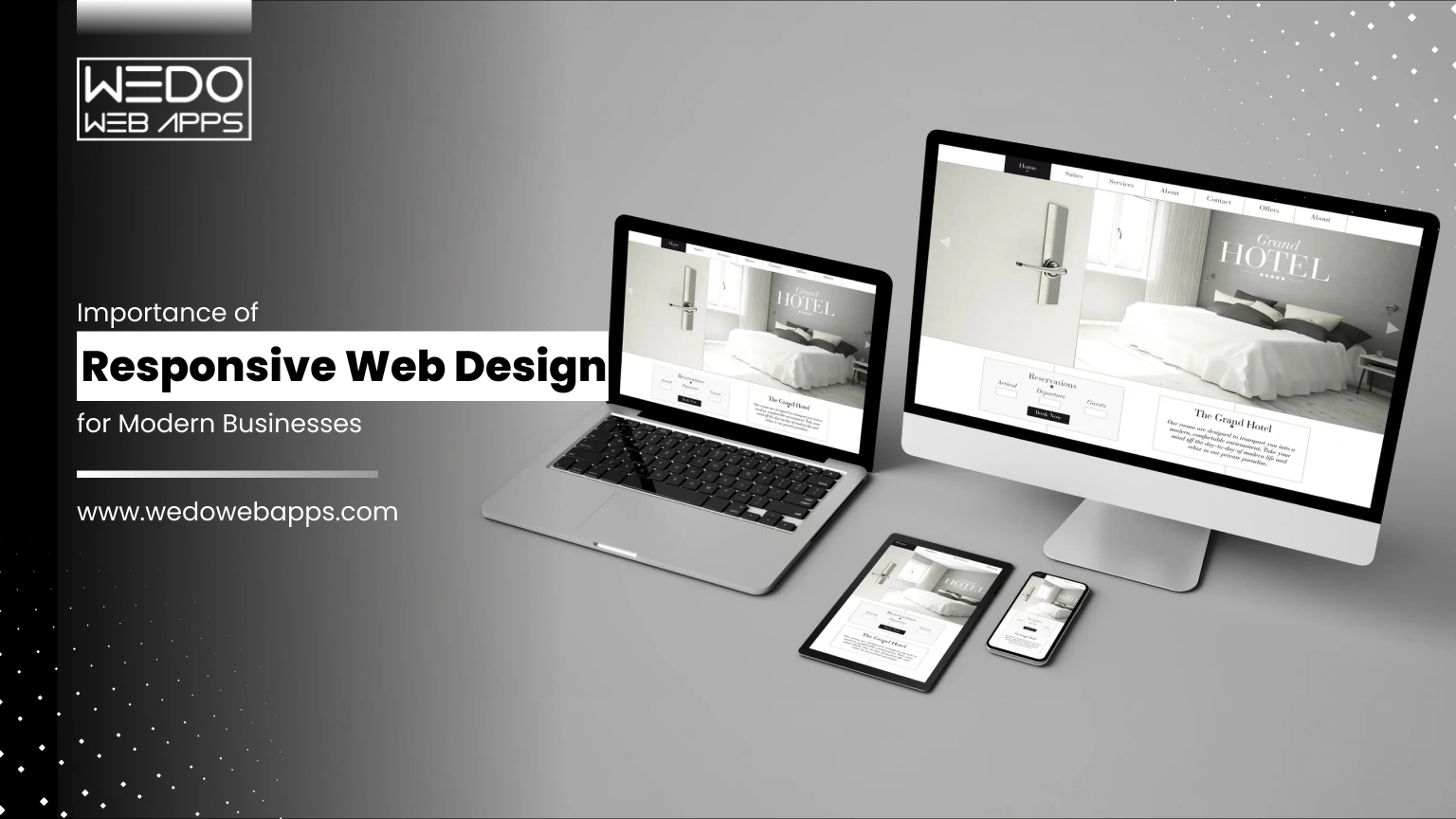
This explains the importance of responsive web design. A responsive website adjusts automatically to mobile, tablet, and desktop screens, so every visitor gets a smooth experience. It improves usability, supports search rankings, and builds trust.
When you understand why responsive web design is important, the business value becomes clear. The benefits of responsive web design include better engagement, lower maintenance costs, and higher conversions. For companies aiming to grow online, a mobile-friendly website is no longer optional. It is a basic requirement.
In this guide, you will learn the mobile friendly website importance, the key benefits of responsive web design, and how responsive web design for businesses leads to higher traffic, better leads, and stronger sales outcomes.
What Is Responsive Web Design
Responsive web design is an approach where a website automatically adapts its structure, content, and visuals to match the screen size of the device being used. Instead of creating different versions for mobile and desktop, one flexible layout serves all users.
This method keeps the browsing experience consistent. Visitors can read, scroll, and interact easily, whether they are on a phone or a large monitor. For businesses, it means one website that works everywhere without extra maintenance.
Simple Definition with Example
In simple terms, responsive web design means a site reshapes itself to fit the user’s screen.
Think of it like text flowing inside a container. On a desktop, content may appear in multiple columns. On a mobile device, the same content stacks into a single column for easier reading. For example, an online store might show four products per row on desktop and one product per row on mobile.
How Responsive Layouts Adjust to Different Screen Sizes
Responsive layouts rely on flexible UI/UX, scalable images, and CSS media queries. These elements allow the page to resize and rearrange automatically.
Menus may turn into a compact icon. Images scale without distortion. Text blocks reposition to remain readable. This adjustment happens in real time, so users do not need to zoom or scroll sideways.
The result is a smooth and mobile-friendly browsing experience across devices.
Responsive vs Separate Mobile Websites
Some businesses create a separate mobile site, often hosted on a different URL. This means managing two designs, two codebases, and two sets of updates. It increases cost and often leads to inconsistent branding.
Responsive web design uses one website for all devices. Updates are easier, SEO performance improves, and users get the same experience everywhere. For most businesses, this single-site approach is more practical and efficient.

Why Responsive Web Design Is Important Today
A website is often the first interaction a customer has with your business. If it looks broken or difficult to use on mobile, visitors leave quickly. That single moment can cost you a lead or even a sale.
This explains why responsive web design is important. It ensures your website works smoothly across all devices, improves usability, and supports measurable business growth.
Growth of Mobile Users and Browsing Habits
Most users now browse with the help of their mobile devices rather than desktops.
- They search for products.
- They compare services.
- They make purchases on the go.
If your site is not mobile-ready, you may lose a large share of potential customers. Responsive mobile app design keeps your pages accessible and easy to use on every screen.
Google Mobile First Indexing and Ranking Impact
Search engines evaluate the mobile version of your website before ranking it. This means:
- A clear structure helps indexing.
- Fast-loading improves rankings.
- Mobile-friendly pages attract more traffic.
A responsive website meets these requirements naturally, which supports better SEO performance.
User Expectations for Speed and Usability
Visitors expect quick results and simple navigation. They want to:
- Read content without zooming.
- Tap buttons easily.
- Move between pages smoothly.
Responsive layouts are built to match these expectations, which increases satisfaction and trust.
How Poor Design Leads to Lost Opportunities
A non-responsive website creates friction.
- Slow pages increase bounce rate.
- Cluttered layouts confuse users.
- Broken elements reduce credibility.
Each issue pushes customers away. Responsive web design removes these barriers and helps convert visitors into inquiries, sign-ups, and sales.
Mobile-Friendly Website Importance for User Experience

Most users now access websites through their phones. They expect pages to load quickly and content to fit their screen without any issues. If a site feels complex to use on mobile, visitors leave almost immediately.
This clearly shows the mobile-friendly website importance. A responsive and mobile-ready layout improves comfort, builds trust, and encourages users to stay longer and take effective action.
Easy Navigation on Small Screens
Navigation should feel simple and direct on a small display. Users must find what they need without confusion or extra taps.
Key practices include:
- Clear and compact menus.
- Large and easy-to-tap buttons.
- Important links are placed within easy reach.
- Minimal clutter on each screen.
When movement across pages is smooth, visitors are more likely to continue browsing.
Clear Readable Content Without Zooming
Content should adjust naturally to the screen size so users can read everything comfortably. They should not need to zoom in or scroll sideways.
A responsive structure ensures:
- Text remains readable.
- Sections stack vertically.
- Images scale correctly.
- Layouts stay clean and aligned.
This keeps the experience relaxed and frustration-free.
Faster Loading Pages
Speed plays a major role in keeping mobile users engaged. Even a short delay can cause them to exit.
A mobile-optimized website focuses on:
- Compressed images.
- Lightweight design elements.
- Clean and efficient code.
- Reduced unnecessary scripts.
Faster pages lead to lower bounce rates and stronger first impressions.
Better Engagement and Longer Session Time
When users enjoy the experience, they interact more with your website. A smooth mobile interface encourages deeper exploration.
As a result:
- Visitors view more pages.
- Time on site increases.
- Form submissions grow.
- Purchases become more likely.
This direct connection between usability and action proves why mobile responsiveness supports both user satisfaction and business growth.

Key Benefits of Responsive Web Design

Once a website works smoothly across devices, the advantages go beyond appearance. Responsive web design improves performance, simplifies management, and supports long-term growth.
For businesses, this means fewer technical issues, lower costs, and better results from the same website. These practical gains clearly show the benefits of responsive web design.
Lower Development and Maintenance Costs
Managing separate desktop and mobile websites requires extra time, money, and resources. Every update must be repeated twice.
This helps you:
- Reduce development expenses.
- Save time on updates and fixes.
- Avoid duplicate content management.
- Lower long-term maintenance costs.
A single system keeps operations simple and efficient.
Single Website for All Devices
Responsive web design uses one layout that adapts to every screen size. This creates a consistent experience for all visitors.
It ensures:
- Uniform design and branding.
- Same content across devices.
- Consistent functionality.
- Easier testing and monitoring.
Users get the same quality experience whether they visit from mobile or desktop.
Consistent Branding and Layout
Brand trust depends on consistency. If your mobile site looks different from your desktop site, it can confuse users. Responsive design keeps colours, fonts, and layouts aligned across screens.
This consistency:
- Strengthens brand identity.
- Builds credibility.
- Makes your business look professional.
- Improves customer confidence.
A clear and familiar design encourages users to stay longer.
Simplified Updates and Content Management
Content should be quick-loading and straightforward. Updating multiple versions slows down your team.
With one responsive website:
- Content is updated once.
- Changes reflect everywhere instantly.
- Errors are reduced.
- Management becomes easier.
This allows your team to focus more on strategy rather than technical tasks.
Improved SEO Performance
Search engines prefer mobile-friendly websites. Responsive design supports better indexing and ranking by keeping everything under one URL.
Key SEO advantages include:
- Faster page loading.
- Lower bounce rate.
- Better crawlability.
- Stronger search visibility.
Higher visibility leads to more traffic, which ultimately brings more leads and sales.
Responsive Design Benefits for Business Growth

A well-designed website should not only look good. It should help your business generate more leads, sales, and measurable results. This is where the responsive design benefit for business becomes clear.
When users can browse comfortably on any device, they are more likely to trust your brand and complete the action that supports your goals. A responsive setup removes barriers and creates a smooth path from visitor to conversion.
Higher Conversions and Inquiries
A mobile-friendly experience makes it easier for users to take the next step. Forms are simple to fill out. Buttons are easy to tap. Calls to action are clearly visible. This convenience increases the number of inquiries, sign-ups, and contact requests without additional marketing effort.
Key outcomes include:
- More form submissions.
- Higher lead generation.
- Improved conversion rates.
Better Online Sales Performance
For eCommerce websites, usability directly impacts revenue. If the checkout process feels complicated on mobile, users abandon the carts.
Responsive web design helps in:
- Displaying products clearly.
- Simplifying navigation.
- Making checkout smooth and fast.
- Reducing cart abandonment.
A seamless shopping experience encourages more completed purchases.
Improved Lead Generation
Many users research services on their phones before making decisions. If your website loads quickly and presents information clearly, they are more likely to connect with you.
Responsive layouts support:
- Easy access to contact details.
- Click to call and quick action buttons.
- Faster landing pages.
- Better engagement with content.
These small improvements help turn visitors into qualified leads.
Stronger Customer Trust and Credibility
First impressions matter. A website that looks outdated or broken on mobile can make your business seem unreliable. A clean and consistent design across devices signals professionalism.
This builds:
- Customer confidence.
- Brand credibility.
- Positive perception.
- Higher return visits.
Trust often influences buying decisions more than pricing.
Clear Tracking and Measurable Results
Managing one responsive website makes performance tracking easier. All user data comes from a single platform, which improves accuracy.
You can measure:
- Traffic sources.
- User behavior.
- Conversions.
- Sales performance.
These insights help you refine marketing strategies and improve overall business outcomes.

Responsive Web Design for Businesses Across Industries

Every industry serves users who browse on multiple devices. Customers may search on their phones, compare options on tablets, and complete actions on desktops. If your website fails to adjust, you risk losing them at any step.
This is why responsive web design for businesses is valuable across sectors. It ensures consistent access, better usability, and smoother interactions for every type of customer.
eCommerce and Retail Websites
Online shoppers expect quick browsing and simple checkout. Any friction can lead to abandoned carts.
Responsive design helps by:
- Displaying products clearly on small screens.
- Making filters and categories easy to use.
- Simplifying cart and checkout steps.
- Supporting faster page loading.
These improvements directly increase completed purchases and revenue.
Service-Based Companies
For service providers, websites often act as the first contact point. Users check services, reviews, and pricing before reaching out.
A mobile-ready layout ensures:
- Easy access to service details.
- Clear calls to action.
- Click to call or quick contact forms.
- Better readability of content.
This makes it easier for visitors to turn into inquiries and leads.
Startups and SaaS Platforms
Startups rely heavily on online presence to explain products and capture sign-ups. A complex or slow interface can push users away.
Responsive web design supports:
- Clear product demonstrations.
- Smooth onboarding flows.
- Faster landing pages.
- Easy sign-up forms.
This creates a strong first impression and improves user adoption.
Healthcare and Education Portals
Users often search for important information such as appointments, schedules, or learning resources while on the move.
Responsive websites provide:
- Quick access to essential information.
- Simple navigation menus.
- Clear content structure.
- Comfortable reading on mobile devices.
This improves accessibility and user satisfaction.
Local and Small Businesses
Local customers frequently search on mobile devices for nearby services. If the website is not mobile-friendly, they may choose a competitor.
Responsive design ensures:
- Contact details are easy to find.
- Maps and directions load correctly.
- Calls and bookings happen quickly.
- Trust is built through a professional layout.
For small businesses, these small advantages can lead to steady growth and more walk-ins or inquiries.
Core Elements That Make a Website Responsive

Responsive web design is not achieved by shrinking a desktop layout to fit a smaller screen. It requires a structured approach where every element adjusts naturally to the device. When these components work together, the website feels smooth, readable, and easy to use.
Understanding these building blocks helps businesses see how responsive web design delivers consistent performance across all devices.
Fluid Grid Systems
A fluid grid forms the base of any responsive layout. Instead of fixed widths, the design uses flexible proportions that adapt to the screen size.
This allows content to resize automatically.
Key characteristics include:
- Percentage-based widths instead of fixed pixels.
- Flexible columns that rearrange smoothly.
- Balanced spacing across devices.
As a result, layouts look organized on both large and small screens.
Flexible Images and Videos
The media should scale without breaking the layout. Oversized images can slow down pages or overflow on mobile devices.
Responsive media ensures:
- Images resize according to screen width.
- Videos adjust without distortion.
- File sizes remain optimized for speed.
- Visual quality stays consistent.
This keeps the website visually appealing while maintaining performance.
CSS Media Queries
Media queries allow the website to apply different personal website styles based on screen size or device type. They help the design respond intelligently.
For example, the layout can change when the screen becomes smaller.
Common uses include:
- Adjusting font sizes.
- Stacking columns vertically.
- Hiding unnecessary elements.
- Repositioning menus and buttons.
These small adjustments improve usability without changing the core content.
Mobile First Design Approach
Mobile-first design starts with the smallest screen and then expands to larger devices. This keeps the experience focused and clutter-free.
It encourages teams to:
- Prioritize essential content.
- Simplify navigation.
- Reduce unnecessary elements.
- Improve loading speed.
Starting small often results in a cleaner and more efficient website overall.
Performance Optimization
Responsiveness is not only about layout. Speed and stability matter just as much. A slow website can drive users away, even if the design looks good.
Performance improvements include:
- Image compression.
- Minified code.
- Reduced scripts.
- Fast hosting setup.
Together, these optimizations create a faster and smoother experience for every visitor.

Responsive vs Adaptive Design: Which Is Right for Your Business
When building a mobile-ready website, businesses often compare responsive and adaptive design. Both approaches aim to improve usability across devices, but the way they are built and maintained is different.
Responsive web design uses one flexible layout that adjusts automatically. Adaptive design creates multiple fixed layouts for specific screen sizes. The comparison below makes the differences easier to understand.
| Factor |
Responsive Web Design |
Adaptive Web Design |
| Layout structure |
Single flexible layout. |
Multiple fixed layouts. |
| Codebase |
One website for all devices. |
Separate templates for each device. |
| Development cost |
Lower. |
Higher. |
| Maintenance |
Easy to manage and update once. |
Updates needed for each version. |
| SEO performance |
Strong with one URL. |
Can create duplicate or split URLs. |
| User experience |
Consistent across screens. |
Can vary between devices. |
| Scalability |
Adapts easily to new screen sizes. |
Requires new layouts for new devices. |
| Time to launch |
Faster. |
Slower. |
| Best suited for |
Most businesses and growing brands. |
Complex or highly customized interfaces. |
For most companies, responsive web design for businesses is the practical choice. It reduces cost, simplifies maintenance, and delivers consistent performance across devices. Adaptive design may suit very specific use cases, but it often adds unnecessary complexity for standard business websites.
Common Mistakes That Hurt Mobile Experience

Even after investing in responsive web design, small mistakes can weaken the mobile experience. These issues frustrate users, increase bounce rates, and reduce conversions.
A website may look fine on a desktop but still perform poorly on phones. Fixing these common problems protects usability and helps you get the full value from your mobile-friendly setup.
Slow Loading Pages
Mobile users expect quick access. If a page takes more than a few seconds to load, many visitors leave before it opens.
Common causes include:
- Heavy images.
- Too many scripts and plugins.
- Unoptimized code.
- Slow hosting servers.
Improving speed keeps users engaged and supports better search rankings.
Tiny Buttons and Hard to Click Links
Small buttons create frustration on touch screens. Users may tap the wrong link or struggle to complete actions.
Good mobile design should include:
- Large tap-friendly buttons.
- Proper spacing between links.
- Clear call to action placement.
- Simple forms.
Easy interaction encourages users to continue browsing.
Popups That Block Content
Pop-ups that cover the entire screen can interrupt the browsing experience. On mobile devices, they often feel intrusive.
This can lead to:
- Higher bounce rates.
- Lower engagement.
- Missed conversions.
Using subtle banners or well-timed prompts keeps the experience smooth without disturbing users.
Poor Content Structure
Long paragraphs, cluttered sections, or cramped layouts make content difficult to read on small screens.
To improve readability:
- Break content into short paragraphs.
- Use headings and subheadings.
- Add white space.
- Highlight key points.
A clean structure helps users scan information quickly.
Lack of Testing Across Devices
A design that works on one phone may break on another. Without proper testing, issues go unnoticed.
Businesses should test on:
- Multiple screen sizes.
- Different browsers.
- Various operating systems.
- Real devices, not only simulators.
Regular testing ensures your responsive web design delivers a consistent experience for every visitor.
Avoiding these mistakes strengthens the mobile friendly website importance and ensures your website supports both usability and business performance.
How to Implement Responsive Web Design Successfully

Creating a responsive website works best when handled step by step. A clear process reduces errors, saves time, and ensures your website performs smoothly across devices. For companies investing in responsive web design for businesses, this structured approach leads to better usability and measurable results.
Step 1. Audit Your Current Website
Begin by reviewing how your existing website behaves on mobile devices. Identify areas that create friction for users.
Check for:
- Slow loading pages.
- Layout or alignment issues.
- Hard to use navigation.
- High mobile bounce rates.
- Low conversions.
This assessment highlights what needs immediate attention.
Step 2. Define User Journeys and Goals
Understand what visitors want to accomplish when they land on your site. Your design should guide them naturally toward those actions.
Common goals include:
- Browsing products or services.
- Reading key information.
- Filling out contact forms.
- Making purchases.
- Booking appointments.
Clear journeys help you place content and calls to action effectively.
Step 3. Choose the Right Tools and Technology
Select frameworks or platforms that support responsive web design from the start. This simplifies development and future updates.
Consider:
- Responsive front-end frameworks.
- Mobile-optimized CMS themes.
- Flexible design systems.
- Custom development when required.
The right setup makes scaling easier.
Step 4. Design with a Mobile First Approach
Start with the smallest screen and expand outward. This keeps the layout clean and focused.
Prioritize:
- Essential content first.
- Simple navigation.
- Large tap-friendly buttons.
- Fast loading elements.
Once mobile works well, adapting for larger screens becomes straightforward.
Step 5. Develop Flexible Layouts and Media
Use responsive techniques that allow the design to adjust automatically.
Include:
- Fluid grid systems.
- Flexible images and videos.
- CSS media queries.
- Scalable typography.
These elements ensure your website looks balanced on every device.
Step 6. Test Across Devices and Browsers
Testing prevents unexpected issues after launch. What works on one device may fail on another.
Test on:
- Multiple screen sizes.
- Different browsers.
- Android and iOS devices.
- Real devices along with simulators.
This ensures a consistent experience for all users.
Step 7. Monitor Performance and Optimize Continuously
Responsive design needs regular improvement. Track how users interact and refine accordingly.
Monitor:
- Page speed.
- Bounce rates.
- Session duration.
- Conversion rates.
Ongoing optimization strengthens both user experience and business results.
Following these steps helps businesses build a mobile-friendly website that supports engagement, improves conversions, and delivers long term value.

How Professional Responsive Web Design Services Help Your Business

While basic responsive adjustments can be handled internally, building a high-performing website often requires expert planning and execution. Professional teams understand how design, speed, usability, and SEO work together to support growth.
For companies looking at responsive web design for businesses, working with specialists reduces risks and delivers stronger results in less time.
Step 1. Strategy and Requirement Analysis
Every business has different goals. A professional team begins by understanding your audience, industry, and objectives before designing anything.
This includes:
- Studying user behavior.
- Identifying target devices.
- Reviewing competitors.
- Defining conversion goals.
A clear strategy ensures the website supports real business outcomes.
Step 2. Custom UI and UX Planning
Templates may not fully reflect your brand or user needs. Experts design layouts that match your identity and make navigation simple.
They focus on:
- Clean page structure.
- Intuitive navigation.
- Clear calls to action.
- Consistent branding across devices.
This improves both usability and trust.
Step 3. SEO Ready and Performance Focused Development
Responsive design works best when combined with technical optimization. Professionals build websites that load fast and rank well.
Key improvements include:
- Mobile-friendly coding practices.
- Optimized images and scripts.
- Clean URL structure.
- Search engine-friendly architecture.
These factors increase visibility and attract more organic traffic.
Step 4. Cross-Device Testing and Quality Checks
Experts test the website thoroughly before launch. This reduces errors that could affect user experience.
Testing covers:
- Multiple screen sizes.
- Browsers and operating systems.
- Forms and checkout flows.
- Speed and stability.
This ensures your site performs reliably for every visitor.
Step 5. Ongoing Support and Continuous Improvement
Websites need regular updates to stay effective. Professional services provide long-term support instead of one-time delivery.
This often includes:
- Performance monitoring.
- Security updates.
- Design improvements.
- Feature enhancements.
- Conversion optimization.
Continuous improvements help you stay competitive and achieve better results over time.
Partnering with experienced teams allows businesses to fully realize the responsive design benefits for business, from better user engagement to higher leads and sales.
Conclusion
A website should work smoothly for every visitor, no matter which device they use. When pages adjust naturally to different screens, users stay longer, interact more, and complete actions with ease. This clearly shows the importance of responsive web design for any business that depends on online traffic.
From better usability to stronger search visibility, the benefits of responsive web design directly impact performance, and the designing services from trusted companies can play an important role. Faster pages, simple navigation, and consistent layouts help reduce bounce rates and improve conversions. Instead of managing multiple versions, businesses control one flexible website that supports growth and efficiency.
If you want steady traffic, higher engagement, and measurable results, investing in responsive web design for businesses is a practical step. A mobile-friendly website is not just a design choice. It is a smart business decision that supports long-term success.


 Sharing Project Details
 Let's have a
call
Let's have a
call Got
Questions? Let’s Chat!
Got
Questions? Let’s Chat!