Are you set to start an eCommerce store? But wait, jumping into the eCommerce industry without any preparation is like driving a car without knowing the directions. The eCommerce industry is gaining immense popularity because of which more and more business owners are planning to sell online with an eCommerce website.
While there is no doubt that you can earn a lot with an eCommerce business, it is not as easy as it sounds. Believe it or not, most small businesses can stand post 5 years of their establishment. Why? The simple answer is that they do not focus on a lot of aspects of online marketing. If you don’t want to fail like them, then learn from their mistakes and try to prevent them.
If you desire to win the race of being the best online business, you should avoid the pitfalls that will affect your business and cause you to lose sales. Even Though mistakes are the opportunity to learn new things, it is better not to make mistakes in the first place. Mistakes would take your customers in the direction opposite to the checkout window, ultimately throwing them straight in your competitor’s arms.
So, if you are planning to start an eCommerce store or even if you already have one, a few common mistakes should be avoided or fixed to grow your eCommerce business or gain more sales. But before directly jumping on to the mistakes, let us first know the characteristics of an eComm website.
Characteristics of an Online Store
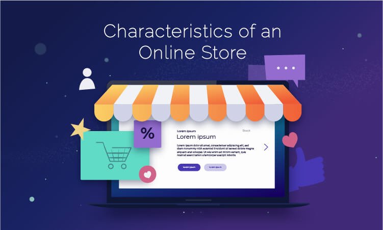
Shifting your business to the digital world is an exciting step for a business. However, if you want to attract online customers and convert visitors into potential customers, eCommerce websites need to be developed right. Following are the characteristics that any website which sells should have.
1. Clear, Easy Navigation
If visitors cannot find what they are looking for on your website, they would probably be disappointed and return back. Customer Satisfaction is significantly improved if the buying process is fast and efficient. Therefore, you need to make sure that your website is easy to use and explore.
How can you offer an excellent user experience to the customers visiting your site? By regular side and top navigation bars; clickable and meaningful labels; significant drop downs and addition of a search bar.
2. Fast Loading Time
What if the loading time of your website is slow? The visitors will stop shopping and walk away from your website to the competitors’ website. This will make you lose potential customers. There are many things you can do to ensure a high loading speed of the website.
The very first thing is to stick to the simple design, use online tools to compress the file size, reduce the use of plugins and redirects, and enable browser caching. This will help you increase the website’s speed.
3. Secure Payment Gateways
A payment gateway is a connection between your eCommerce store and your merchant bank. It sanctions your customers’ debit and credit card payments just like a cashier in some physical store. Being necessary for online transactions, it can be another reason for cart abandonment if not set up correctly.
Online customers want their personal data to be safe, so eCommerce stores follow the best practices to ensure that the customer data is encrypted and protected. For this, they ensure obtaining and installing SSL certificates on their website.
Read more: Grow your E-Commerce business with best Woocommerce Development Services
4. Strong Social elements
These days, customers do not prefer buying anything without seeking assurance from others. So, to make sure that your customers convert to buy, you need to offer several directions to fulfill this need.
Include social media links on your website so that people can comment, like, and share the experience with your products. Additionally, you can add reviews and customer testimonials to your website. The more positive social proof you showcase, the higher level of trust you will perceive.
5. Multichannel Customer Support
Professionally providing exceptional on-time customer support is very important for your business’s success. It is pretty frustrating to see a website with no clear contact details, and that walks you through long FAQ channels.
The key to success is offering your customers a wide range of options to get in touch with you. For example, a phone number, email address, or live chat feature can be the most effective solution for your customers to contact you directly.
6. Effective Call to Actions
Even if your web store looks perfect and works smoothly, it has a problem if your customers do not know where to click. This is where the call to action buttons come into the realm. They tell customers where to click, what to do, and what to buy. Examples are “proceed to checkout”, “click here”, etc.
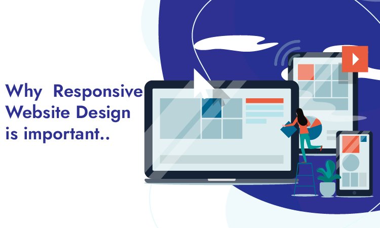
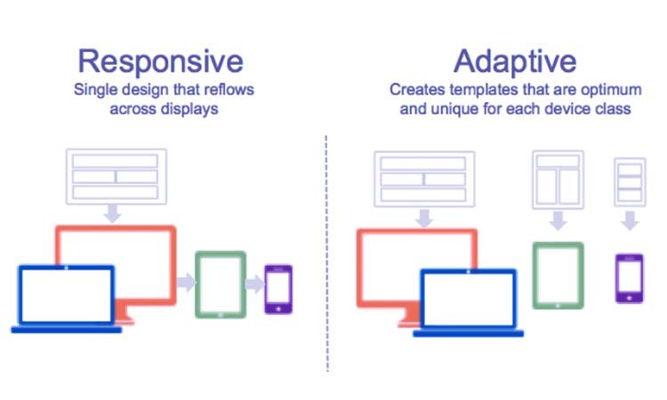
7. Mobile Responsiveness
Every year more and more people are shifting on to their phones for shopping. So, if you don’t have a mobile-friendly website that offers your customers a great experience, you will probably be left behind.
Responsiveness is essential because if your website isn’t responsive, it will likely be slow to load. In addition, it will have an awkward layout, and the website will ask for zooming and scrolling to see the website’s content. This will significantly stop them from converting into customers.
Read more about How to Choose the Best Responsive Website Design Services
These were the essential characteristics of an eCommerce store, and now let’s come to the main point that is “Common Mistakes to Avoid while developing a web store.”
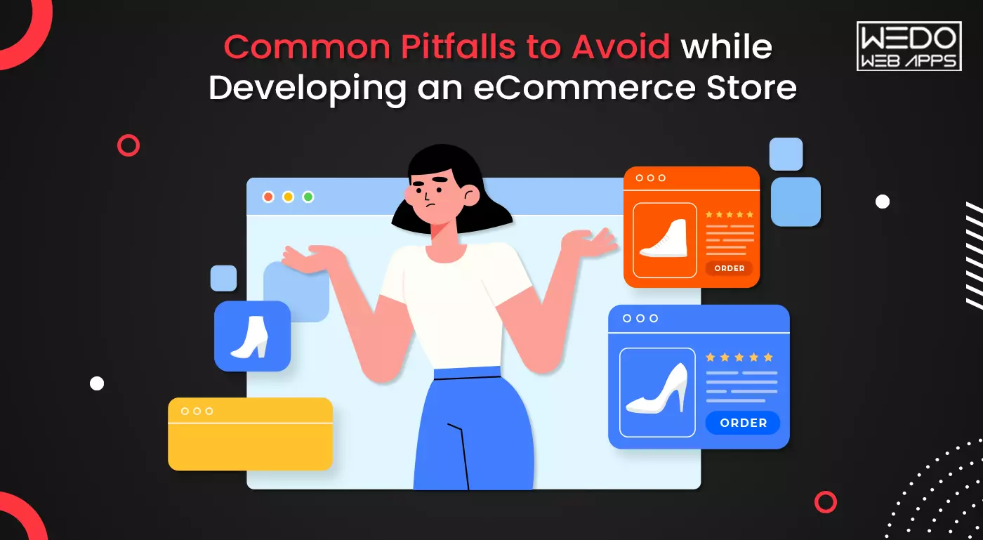
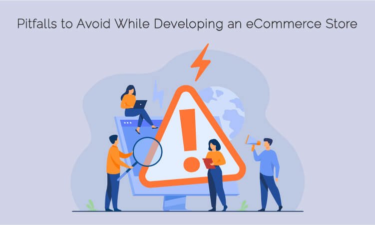
Pitfalls to Avoid While Developing an eCommerce Store
From offering limited payment options to not offering multiple shipping options and not having a mobile-friendly website, there are a lot of things that can lead to a drop in sales. Due to this, you will also fail to drive quality traffic to your website. Moreover, you may also lose your customer’s trust.
So, let’s go through a few eCommerce mistakes that a business website should avoid in order to boost sales and stay ahead in the competition in the eCommerce industry.
1. Not Doing a Proper Research
Developing and running an eCommerce store efficiently demands a lot of time and effort. However, you need to make sure that you are investing your resources intelligently, as some of the things you are doing may go to waste. How will you prevent this?
You can prevent this issue by doing thorough research about your business niche. Not only eCommerce, but before you start anything, you need to do extensive research of the target audience, market demand, and many more things. Identify what may get clicks and whatnot. This will definitely help you reduce some of the problems.
2. Communication Gap
Make sure that your consumers can easily reach to communicate with you. Yes, it is a bit difficult, but if you are always available for your customers, it will build a sense of trust in them. Also, this will increase your business efficiency.
As discussed above, most of the business owners forget to add reliable contact information to their website or create a trustable helpline for the customers to contact them. This is a widespread eCommerce mistake that can significantly affect the sales of your online store.
3. Too Much of Pop-Ups
It is a fact that ads, if used efficiently, can be a great way to earn money. Unfortunately, these days, customers lack the patience to wait for what they want. Therefore, you have significantly less time to catch the attention of your customers. That is why Pop-up ads are used. They are very classy and fabulous at grabbing customer attention.
However, what many business owners do is overuse the pop-up ads, which ultimately take over their original content. Overuse of pop-ups can be very irritating for your customers and may lead the customer to quit the website sooner or later. You need to give some space to the customers to let them access your website.
4. Having no SEO Strategy
You might have heard a lot of times about the importance of SEO for online businesses. You can find this term in almost every checklist of the business looking to grow online. There’s no point repeating the things you’ve already heard a lot of times as it is the most crucial part of digital marketing services.
No matter how exclusive your website looks or how valuable your products are, every effort of yours comes down to how your eCommerce website is performing the search engines. Therefore, the search engine rank of your website is very important.
5. Not Optimising your Site for Mobile Devices
These days most people prefer mobile devices for shopping online or accessing any other kind of website. Now, this is a situation to think about. Just Imagine you have developed a website that is compatible only with desktops but not smartphones. Now what? You will likely lose a potential customer, thereby decreasing sales.
As an online entrepreneur, you should always think of a solution that will give you maximum sales. We would suggest you avail of responsive website designing services to develop a website that is optimized for all the devices and can respond immediately to the user’s action.
6. Not Following the Trends
“Eureka” – This means the joy of discovering something out of the box. However, unless you have a life-changing idea, do not try to do anything unique from the very start. Instead, stick to the basics of eCommerce and try exploring the best approach for you and your storefront.
Doing this might help you discover your Eureka moment with the pathway to direct your marketplace towards success.
7. Lack of Descriptive Product Information
What is the primary purpose of creating an online marketplace? To start selling your offerings, right? Creating a business plan, developing an engaging website with the best eCommerce platform; everything is necessary. But when you upload your product on your website, it should have detailed information along.
Customers only buy the products when they know about them. And if you don’t write a description of the product, you will probably lose your customer. Online Marketing eliminates the interaction between the customer and the business owner.
As the customers cannot touch, feel, or sense the product, your description is the only thing that can convince them to buy. Therefore, never miss writing descriptive and creative details about your product.
8. Poor Navigation
It is yet another common eCommerce mistake that most of the business owners commit. A good-looking, engaging website is a secondary thing, but if your users cannot find what they are looking for, then there’s no point in your good-looking website.
Always remember to develop a website that is easy to use and navigate. Give your customers the best and easy experience on your website. This will definitely help you convert your website visitors into potential buyers.
9. Lack or No Effective eCommerce Policy
Even in this advanced time, many people are still scared to buy anything online. That is because they are concerned about security. However, trust is the most important thing between a seller and a buyer, and it is the truest in the case of eCommerce websites. There are a lot of things that build trust.
One of those things is an effective marketplace policy. Many buyers are concerned about the shipping method, return and exchange policy, and payment methods. Hence, you should have a clear eCommerce policy for all these things in order to build trust in your consumers.
10. Overlooking Website’s Security
Being the owner of the website, you are not only concerned about the security of your data but also the security of your customer’s personal information. You will need everything that can keep your website data safe and secure all the time.
Overlooking the website security is a blunder that can pull you down on the search engines and affect your sales in the end. Therefore, always remember to include everything in your website that will keep your and your users’ data safe.
Final Words
Making a mistake while developing your business storefront can cause you to pay a considerable amount in the long run. Therefore, it is essential to create a business plan to avoid blunders. Prepare yourself beforehand to avoid the eCommerce mistakes that other entrepreneurs have committed and are now suffering from a considerable loss.
If you successfully avoid these mistakes from the start itself, you will save a lot of time and money. However, if you have already made these mistakes earlier, it’s not too late to fix those issues.
If you want to develop a website from scratch or fix the eCommerce mistakes in your existing website, WeDoWebApps LLC can help you. We have been offering responsive web design services for a decade now, and we are experts in developing websites, avoiding every blunder that can cause you a huge loss. Contact us to get your error-free and responsive website created by the experts.